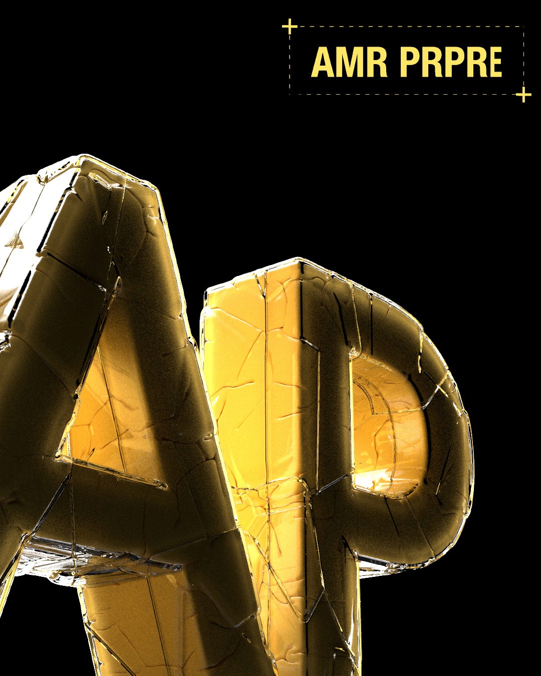
amour propre
description
Since was Amour Propre's first brand identity, we started off the process with a thorough brainstorming session with a clear goal to get to the roots of what AP stands for:
Love for oneself
The dirty type that often gets looked down upon. The one that satisfies your morally questionable desires. The one that screams " I look good ". We decided to convey the message through a comforting bright, bold yellow.
Client
Amour Propre
Year
2024
Category
Art Direction & 3D Design
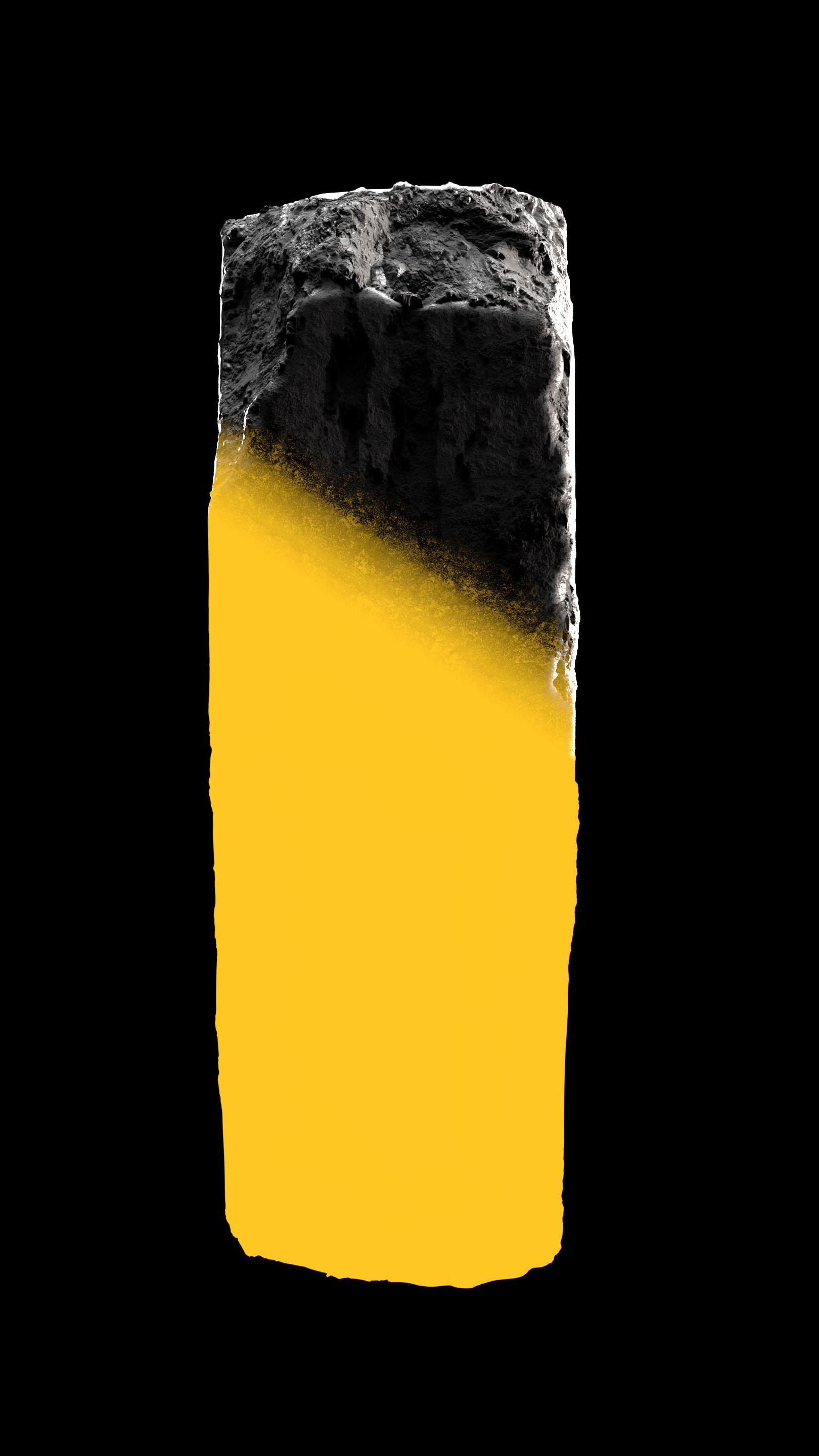
The first part of the project had to celebrate the individuality of the typical AP customer. So we generated different procedural "trims" of the AP logo. They had to be bold, expressive and sleek and yet playful


Explorations
We looked at the AP clothing item as an anthropologic equivalent of the bright, interesting patterns animals use to draw attention from the opposite sex.
Being generated procedurally meant we could print them on t-shirts, and each image would be unique, as we all are.

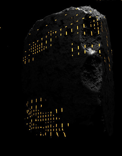
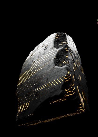
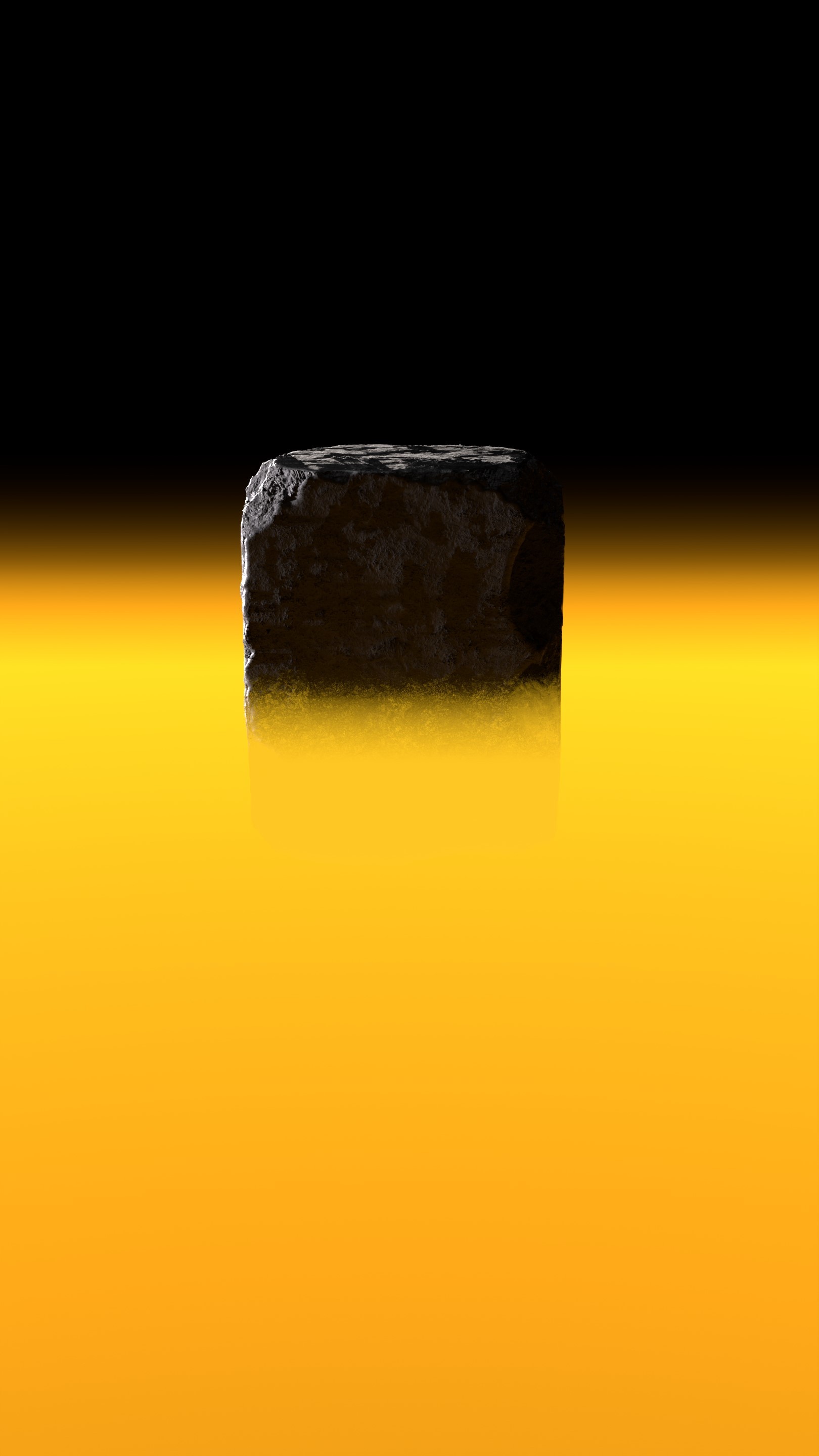
The second part of the campaign was a short story-driven film. A stone goes through a full metamorphosis, evolving into something new.
A simple metaphor for becoming who you are—loudly, and without asking for permission.
Short films
Environmets
Hero Assets Development

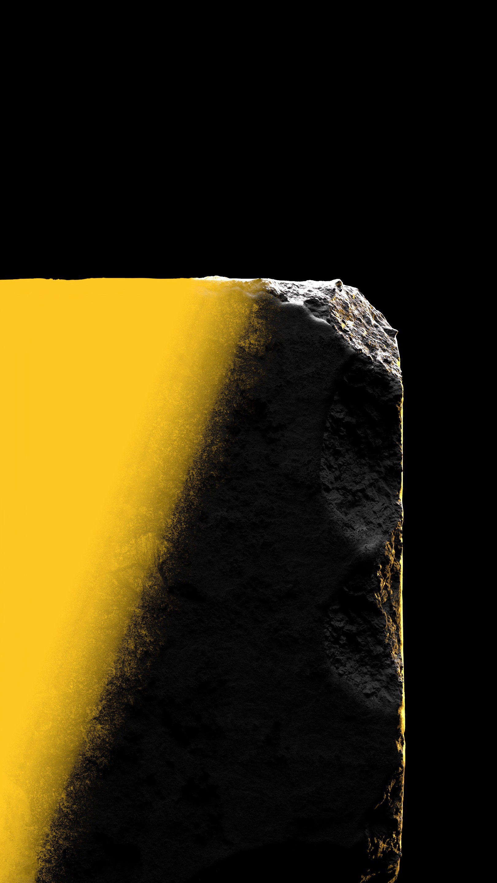
RBD Fracture


Pre-trigger signalling