LOCAL/
12:36:45
Homepage
molec
concert visuals
molec
concert visuals
molec
concert visuals
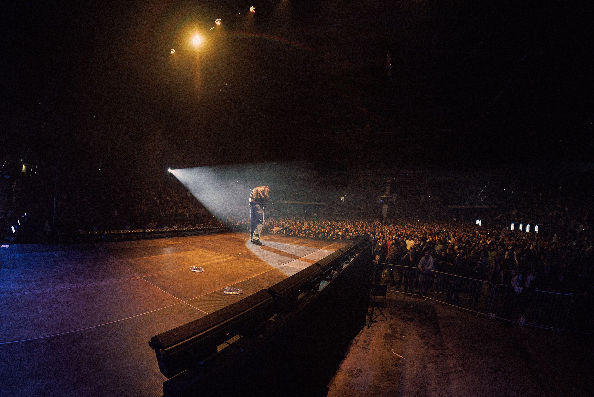
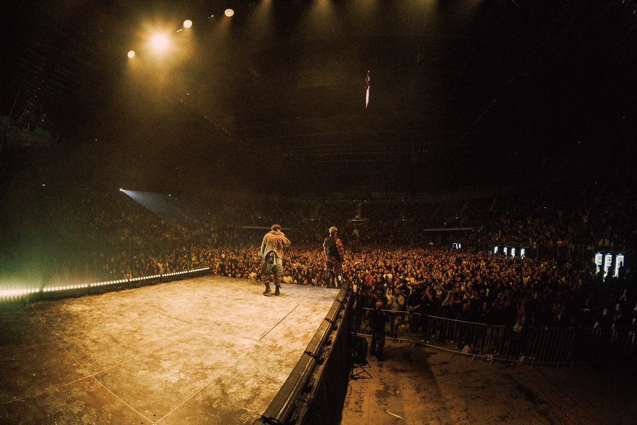
Concert visuals for Molec, one of Bulgaria's biggest duos, built for the largest live show they had played.
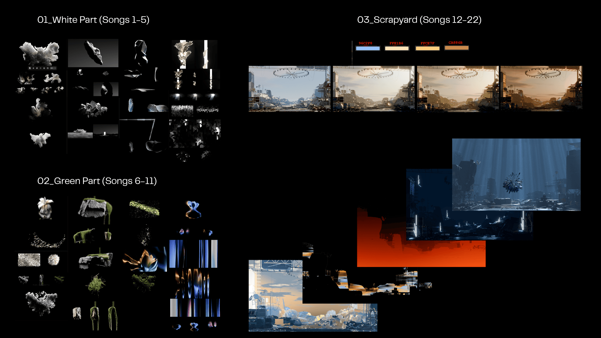
The set moved through three acts, each with its own character. A choir opening held in black and white. An acoustic middle built from procedural nature. Then a scrapyard, running as one continuous environment across the second half of the night.
Twenty two visuals in total, developed under Chris Zahariev's creative direction. The strongest are shown here.
Concert visuals for Molec, one of Bulgaria's biggest duos, built for the largest live show they had played.
The set moved through three acts, each with its own character. A choir opening held in black and white. An acoustic middle built from procedural nature. Then a scrapyard, running as one continuous environment across the second half of the night.
Twenty two visuals in total, developed under Chris Zahariev's creative direction. The strongest are shown here.
Client
Molec
Year
2024
Services
3D Design
Content Creation
Motion Design
Tools
Blender
Houdini
Da Vinci

00_Overview
00_Overview
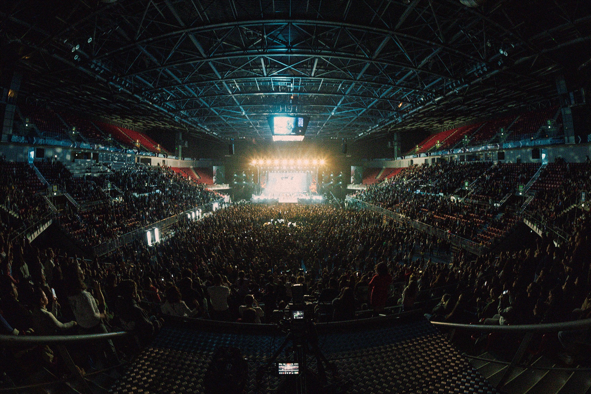
Molec’s lyrics are rooted in tradition and faith, using words, structures, and themes more commonly found in old poetry than in contemporary music. At the same time, the sound is unmistakably modern — driven by rhythm, current production techniques, and a sense of forward momentum. The contrast between what is said and how it sounds creates a tension that defines the project.
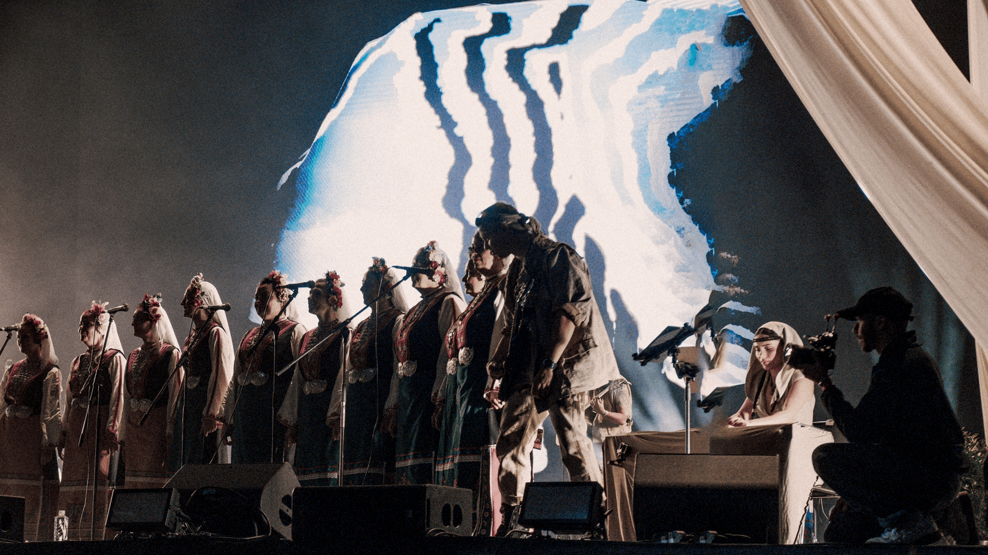
This tension shaped the visual direction. The visuals needed to exist between those two worlds, supporting the performance without competing with it or explaining it. Over time, a clear visual language emerged. Abstract, elemental forms replaced recognizable imagery, allowing the visuals to feel grounded and restrained rather than illustrative. Treated as monolithic presences instead of decoration, they leave space for interpretation and keep the focus where it belongs — on the music and the performers.
Molec’s lyrics are rooted in tradition and faith, using words, structures, and themes more commonly found in old poetry than in contemporary music. At the same time, the sound is unmistakably modern — driven by rhythm, current production techniques, and a sense of forward momentum. The contrast between what is said and how it sounds creates a tension that defines the project.
This tension shaped the visual direction. The visuals needed to exist between those two worlds, supporting the performance without competing with it or explaining it. Over time, a clear visual language emerged. Abstract, elemental forms replaced recognizable imagery, allowing the visuals to feel grounded and restrained rather than illustrative. Treated as monolithic presences instead of decoration, they leave space for interpretation and keep the focus where it belongs — on the music and the performers.
The show ran in three parts, each with its own musical character and visual demands. All three had to read as one language.
01_White Part (feat. choir)
01_White Part (feat. choir)
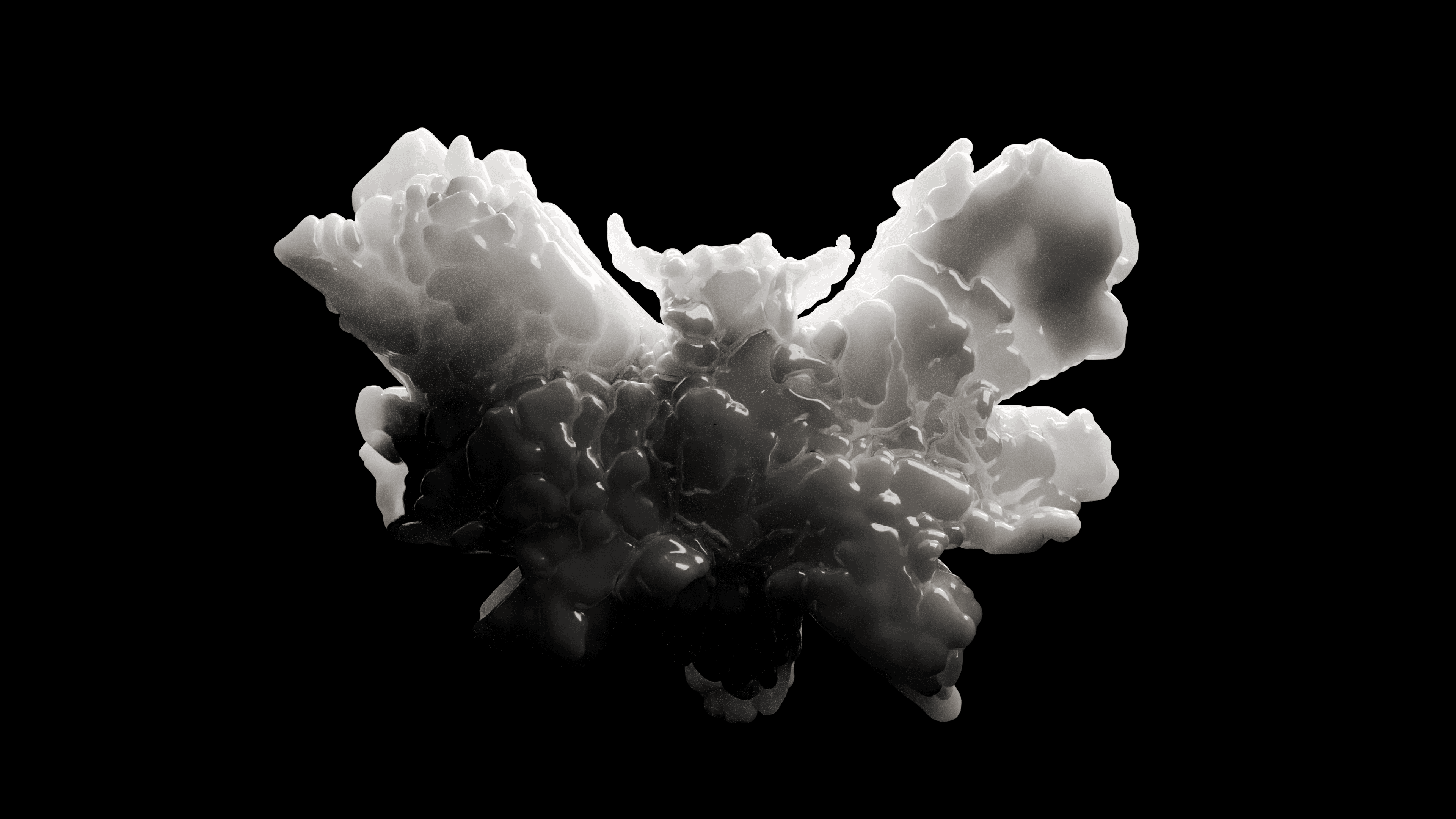
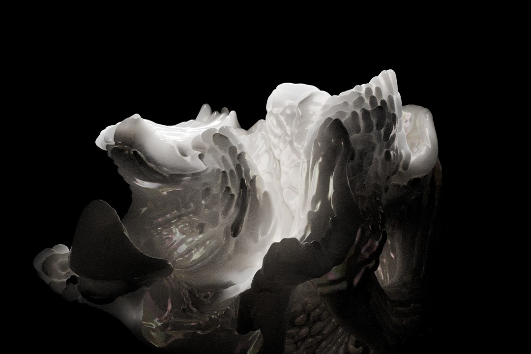
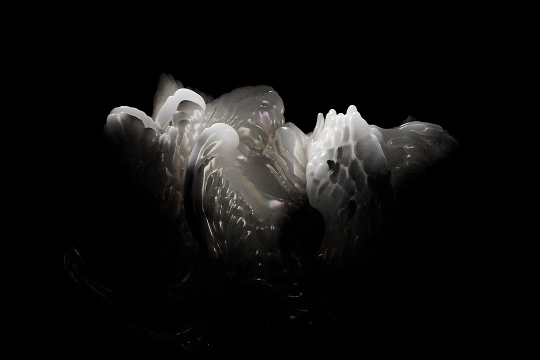
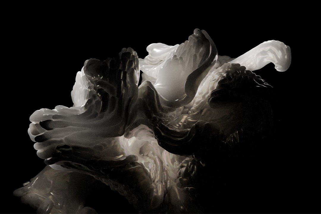
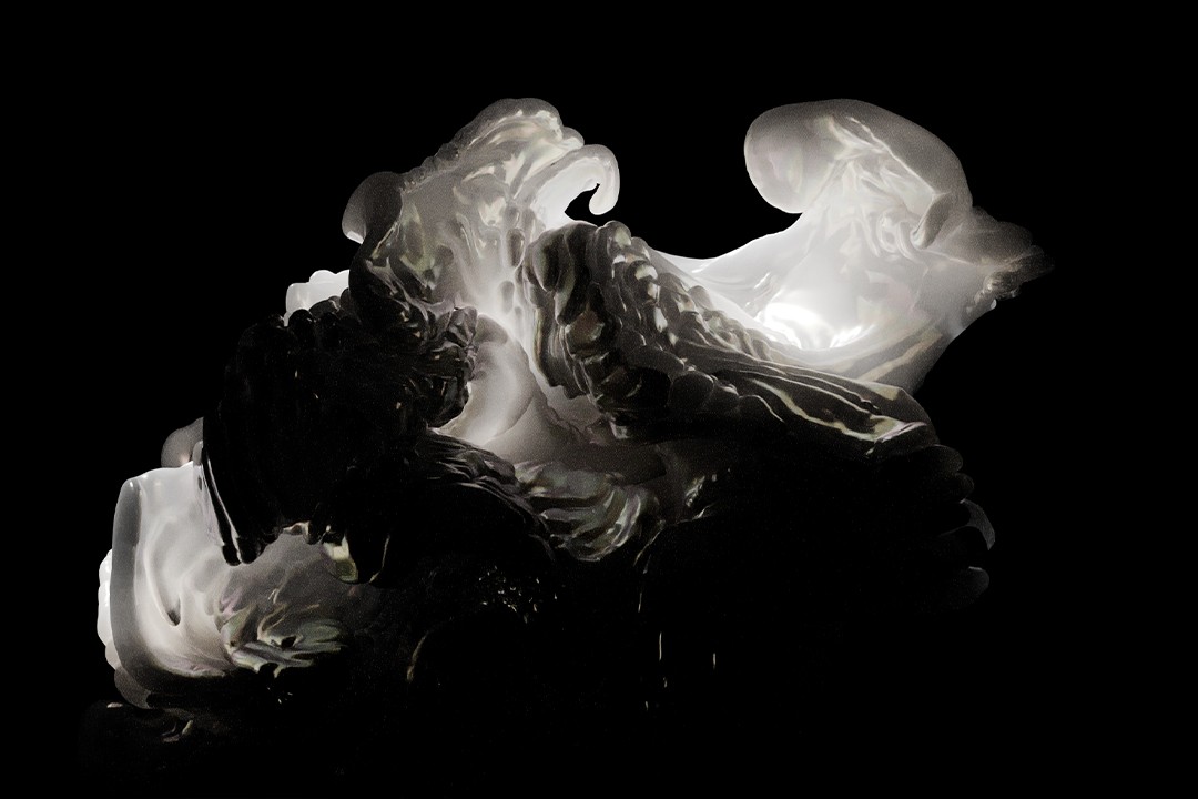
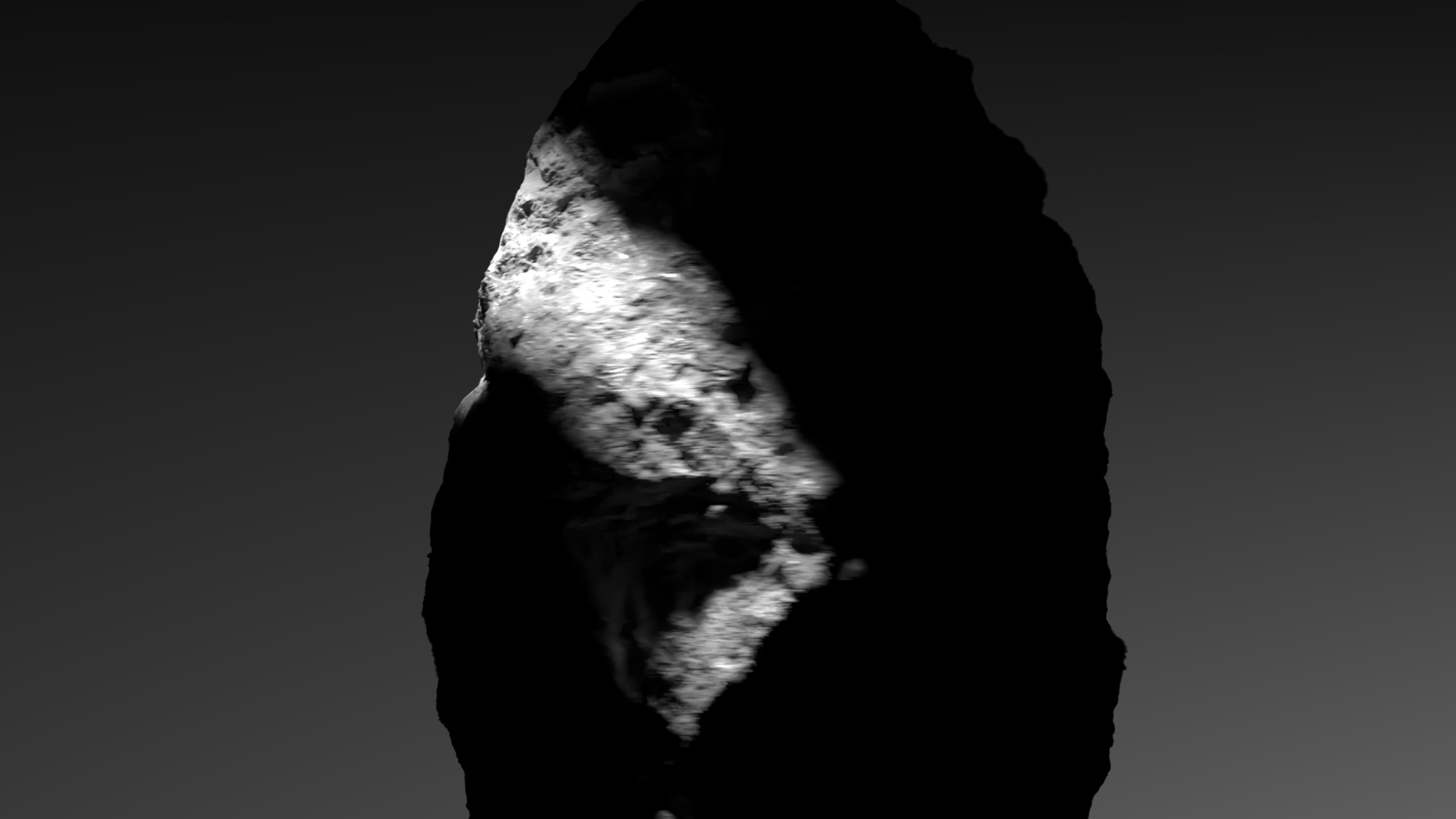
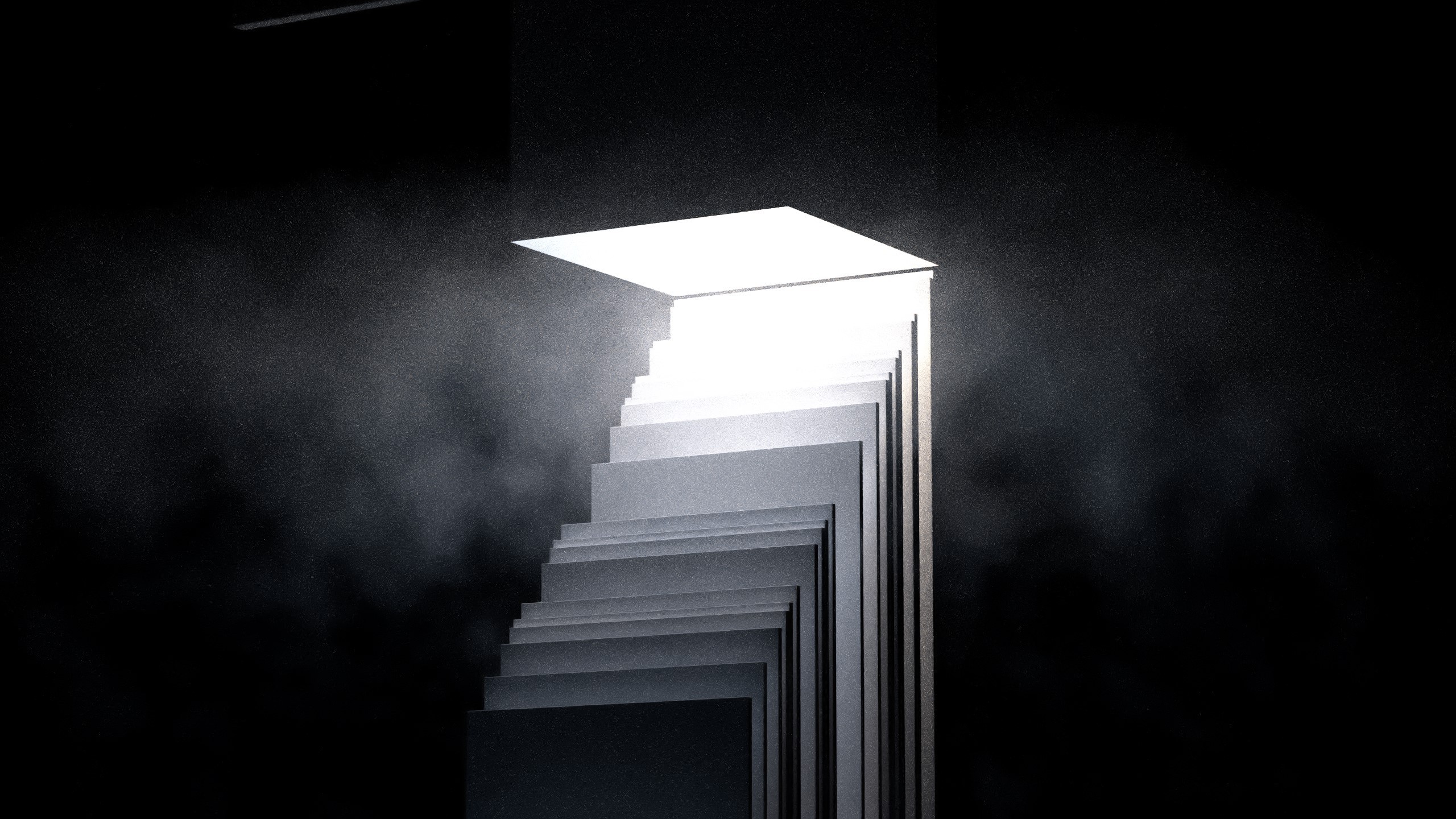
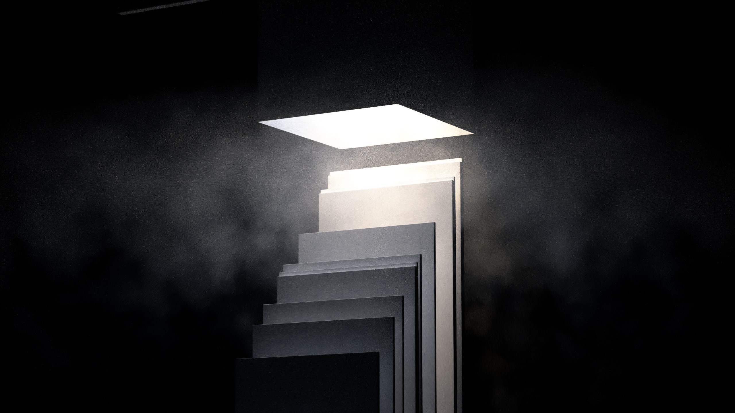
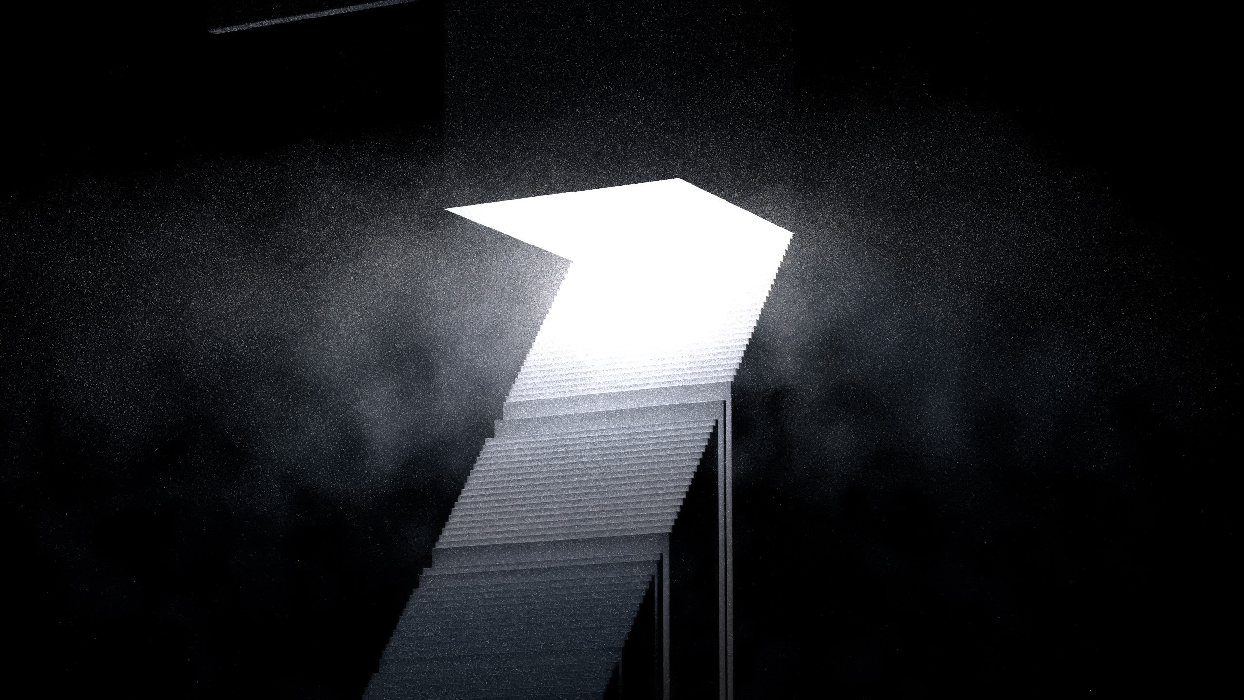
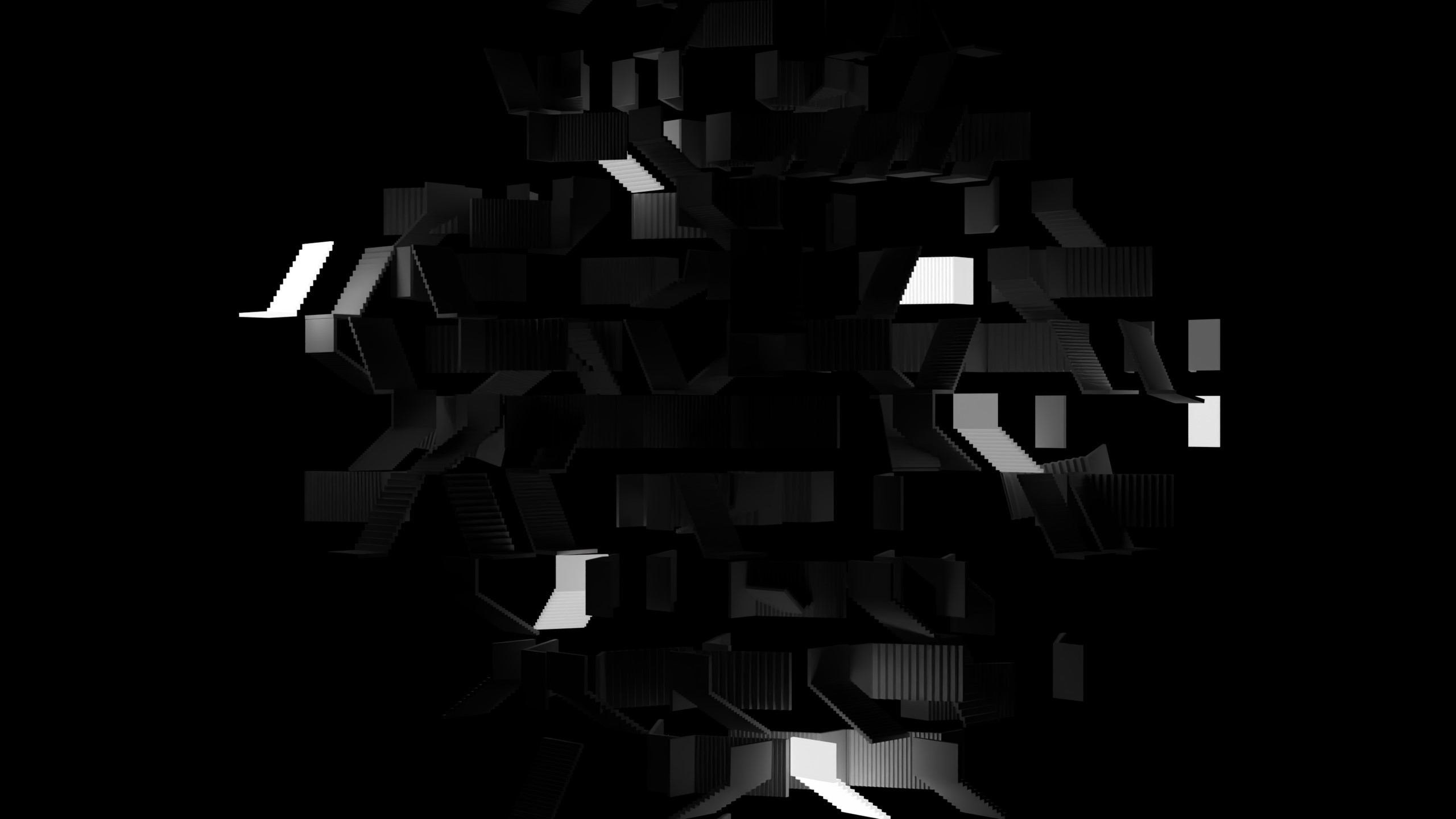
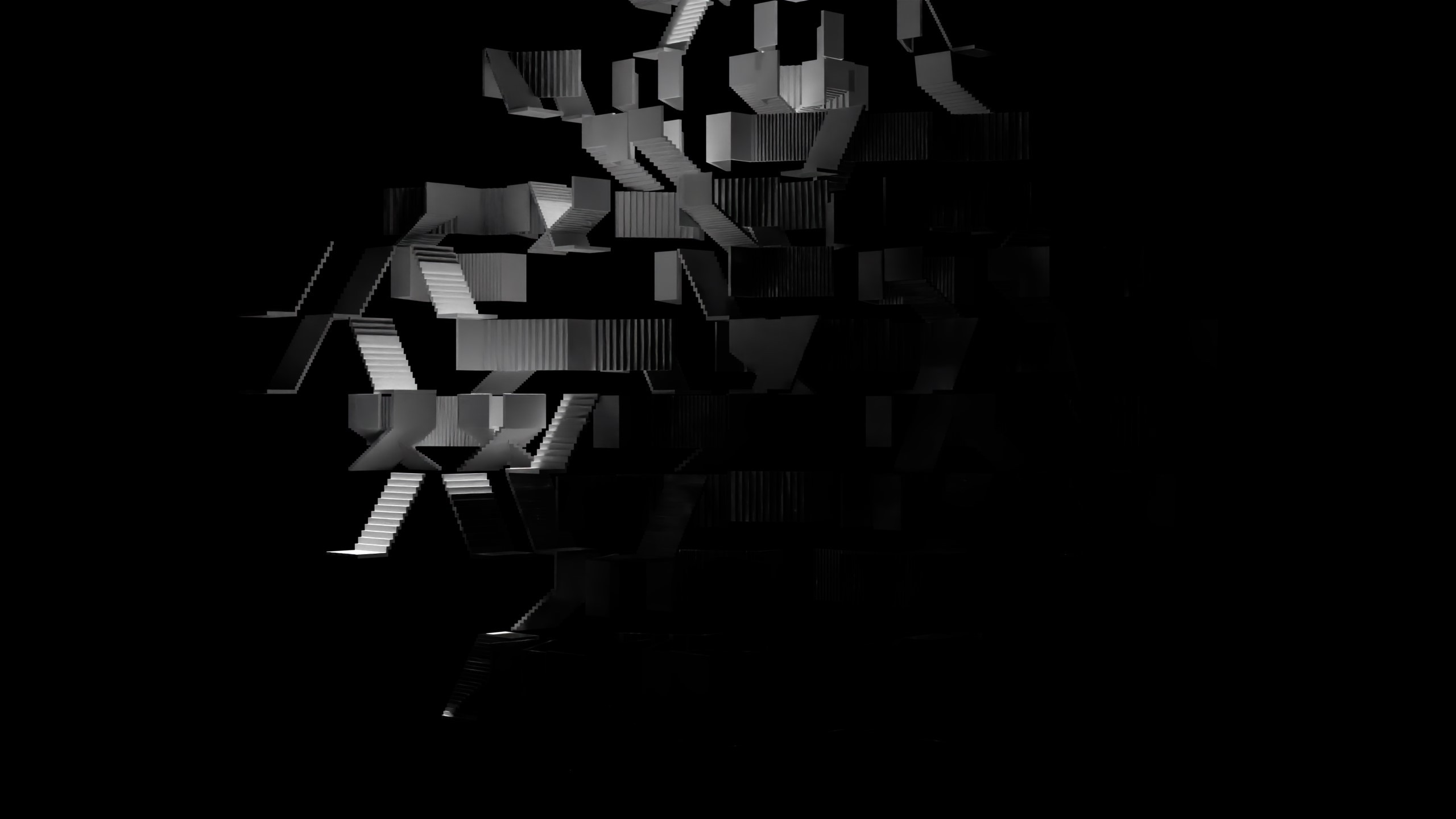
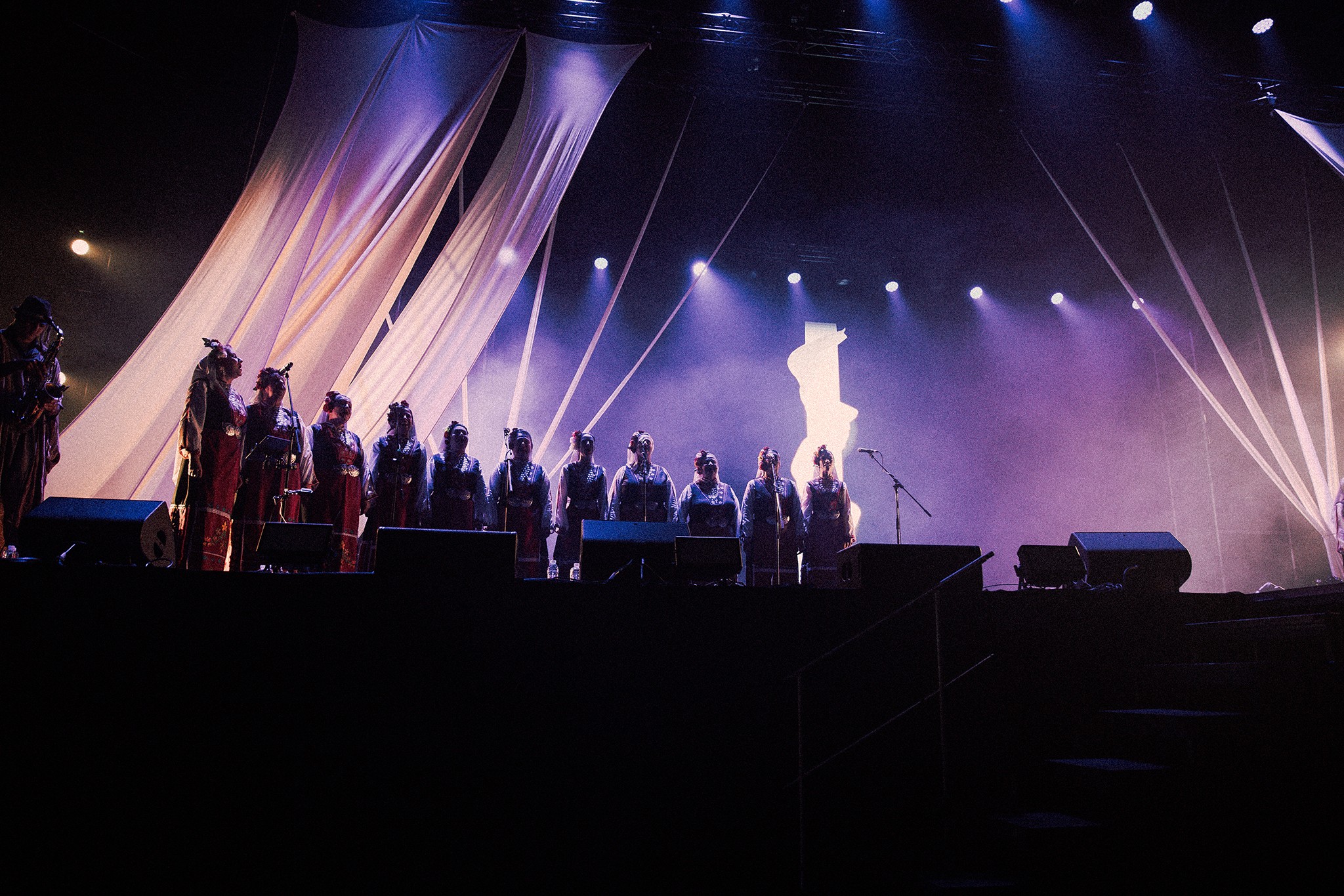
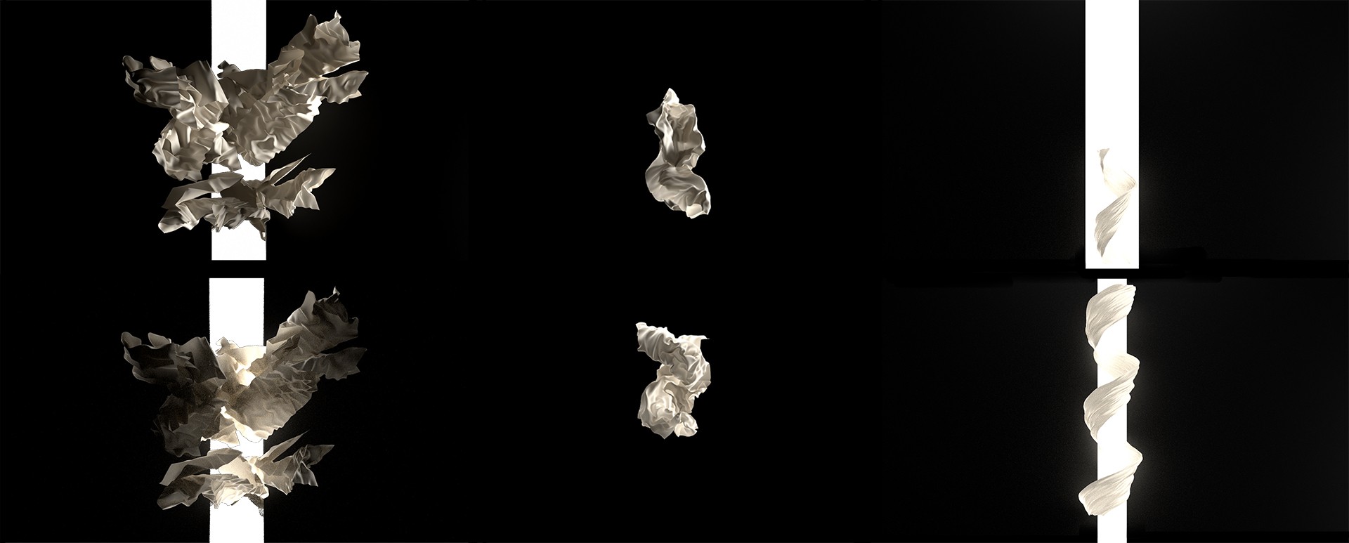
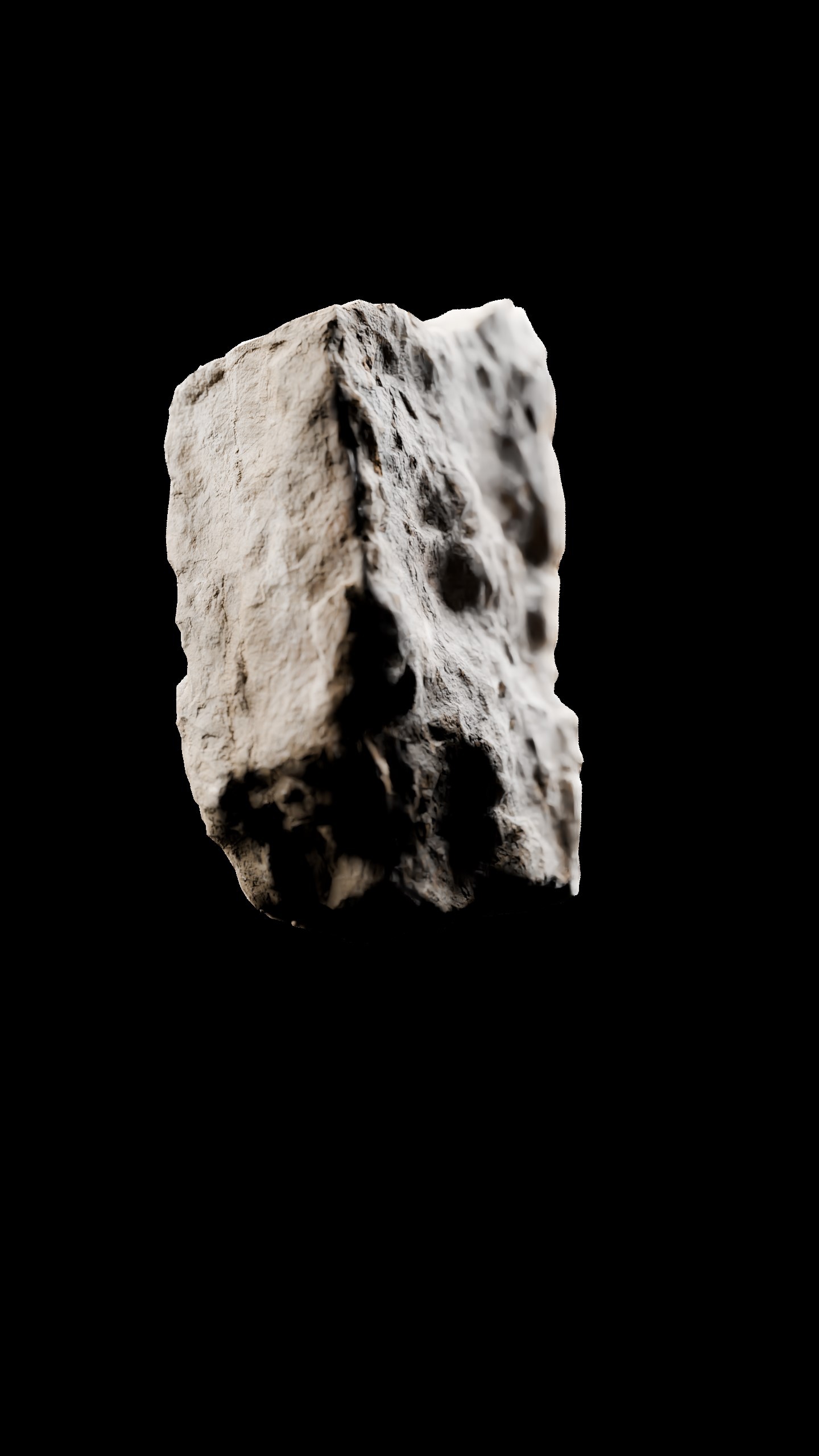
The opening section called for the most restrained visual approach of the show. The palette was reduced to black and white, emphasizing clarity, purity and presence while avoiding unintentional symbolism. A small set of motifs - portals, stair-like structures, and natural elements - formed the basis of the visuals. These elements carried spiritual weight without relying on literal imagery or iconography.
Working within such a delicate space required care; the visuals needed to remain respectful and calm without becoming static or boring. By varying composition, scale, and pacing, these limited elements were developed into a wide range of material that could support the energy of the performance.
The opening section called for the most restrained visual approach of the show. The palette was reduced to black and white, emphasizing clarity, purity and presence while avoiding unintentional symbolism. A small set of motifs - portals, stair-like structures, and natural elements - formed the basis of the visuals. These elements carried spiritual weight without relying on literal imagery or iconography.
Working within such a delicate space required care; the visuals needed to remain respectful and calm without becoming static or boring. By varying composition, scale, and pacing, these limited elements were developed into a wide range of material that could support the energy of the performance.
01.1_euphoria.mp4
01.1_euphoria.mp4
01.3_Stene_Sartseto_Mi.mp4
01.3_Stene_Sartseto_Mi.mp4

01.4_Vyatara.mp4
01.4_Vyatara.mp4
01.5_7_Dni.mp4
01.5_7_Dni.mp4
01.6_Ne_Nam.mp4
01.6_Ne_Nam.mp4
02_Green Part (Acoustic)
02_Green Part (Acoustic)
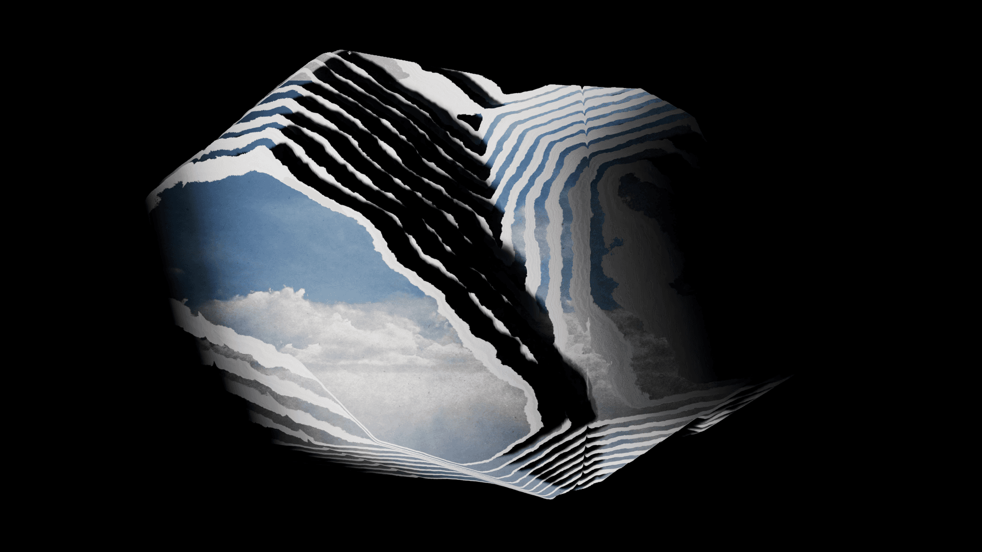
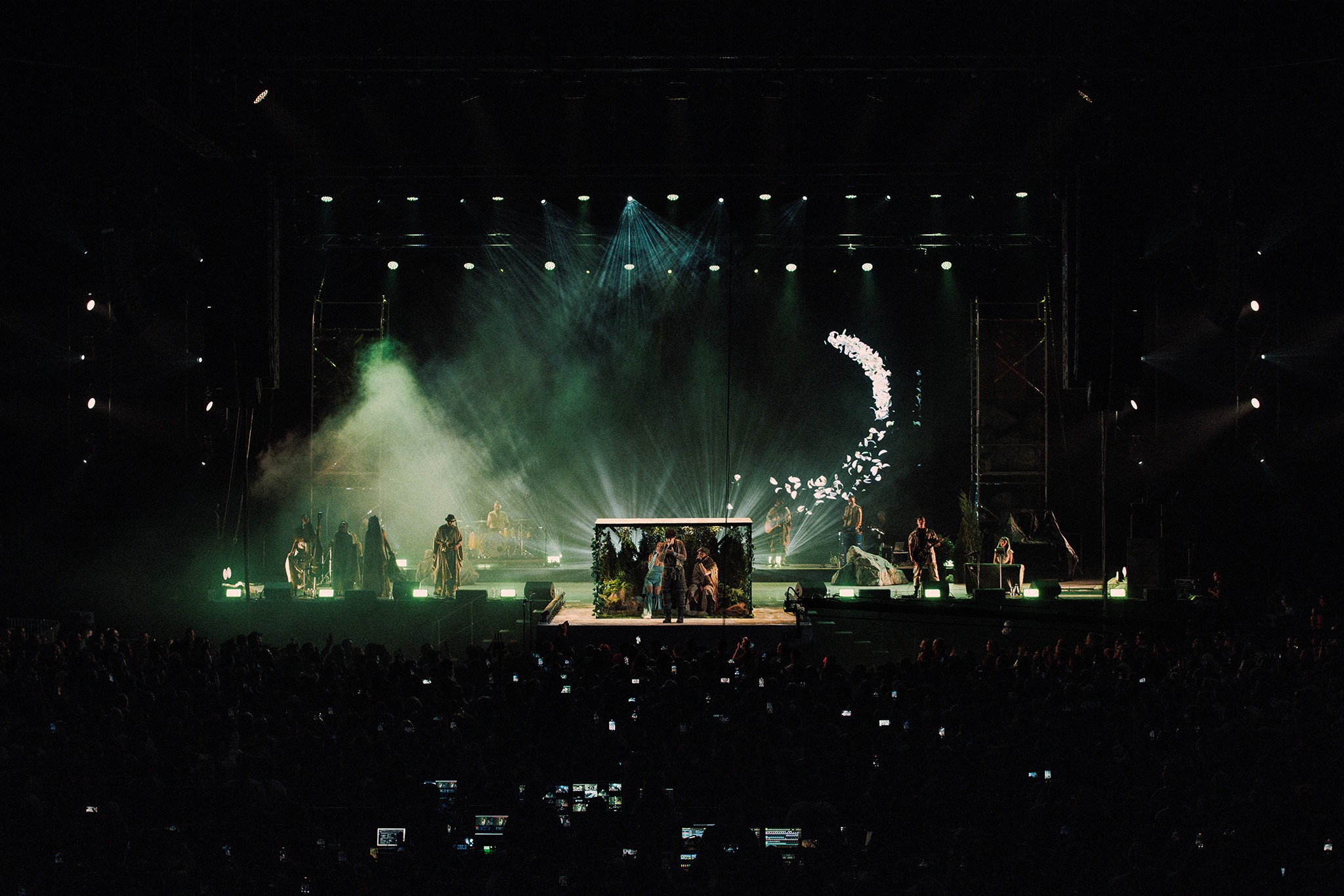
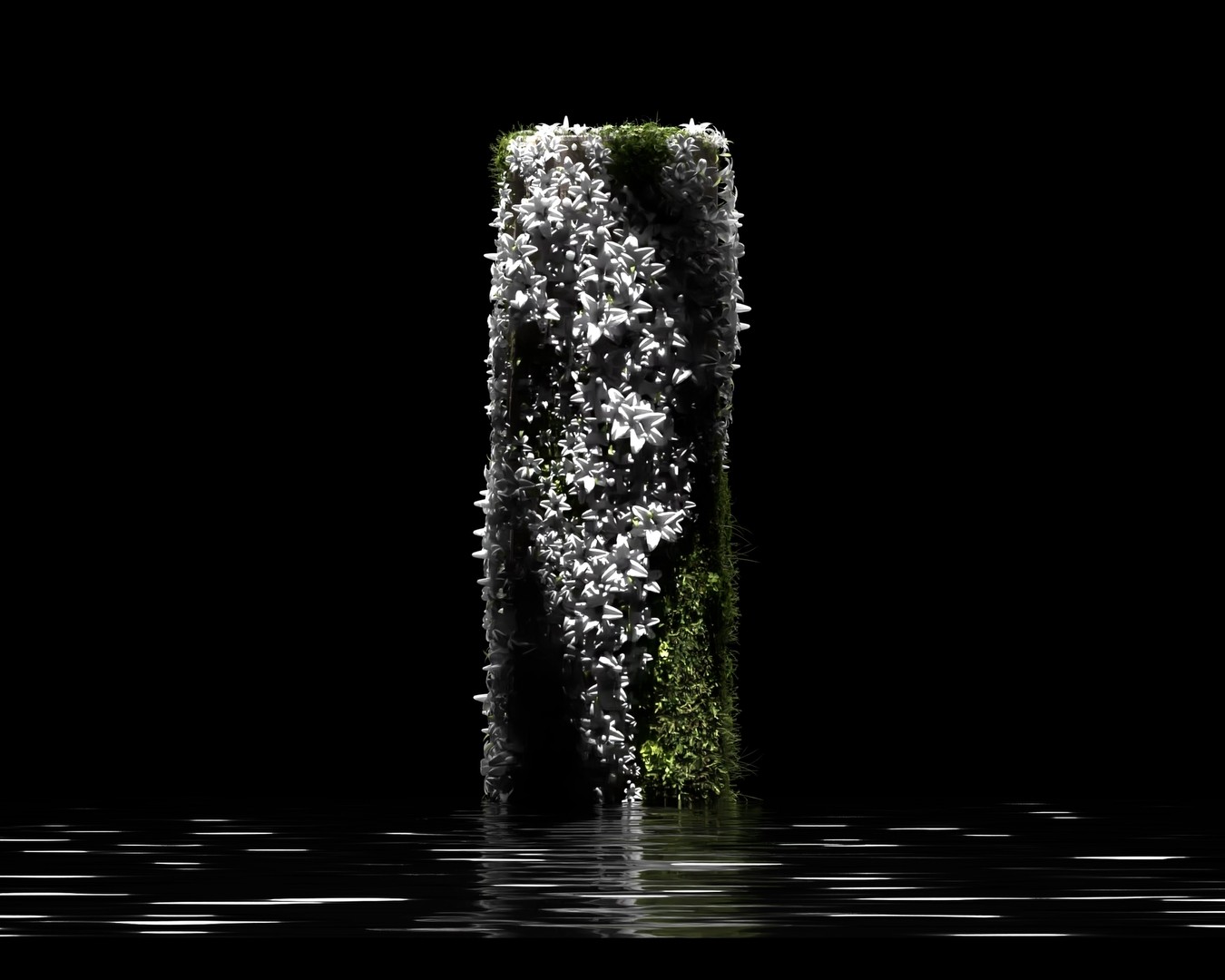
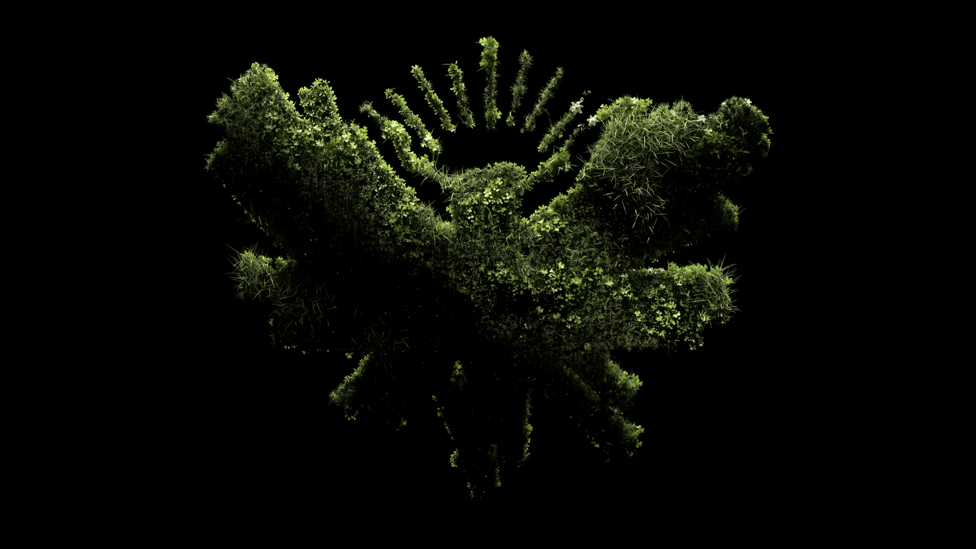
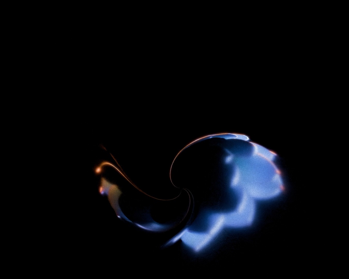
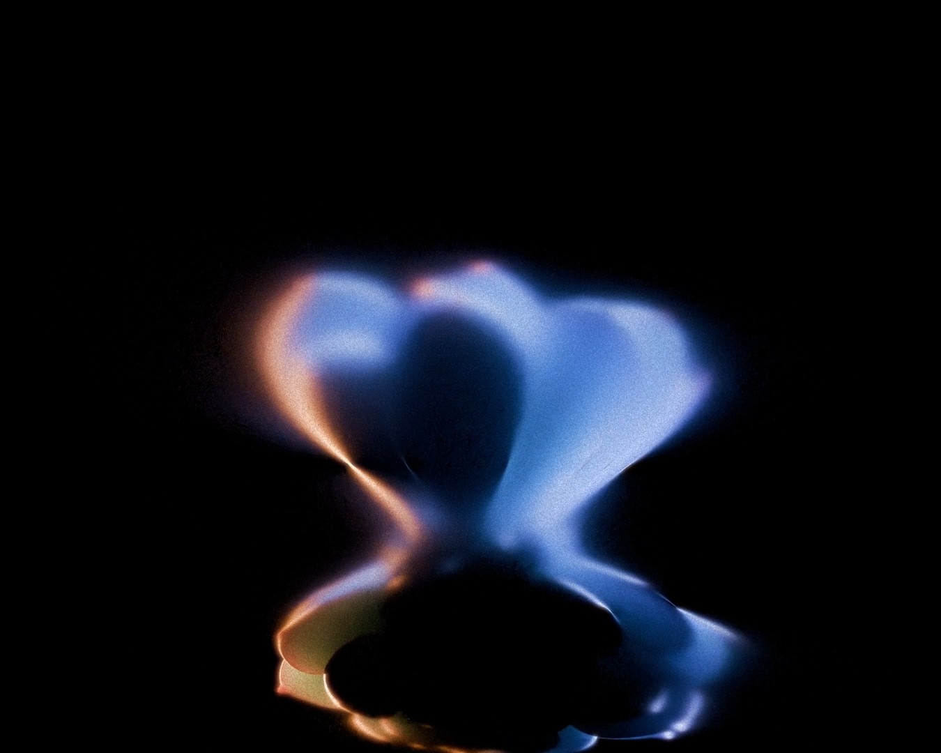
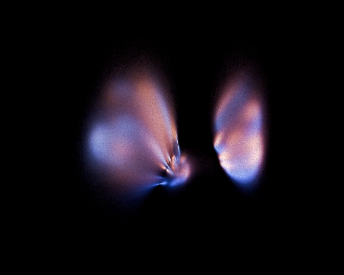
The acoustic section removed rhythmic structure and shifted the focus toward intimacy and tone. With no beat to follow, the visuals were designed to move with the music rather than synchronize to it. Nature became the central theme, explored through procedural blossoms, an endlessly blooming flower, and a liquid grass system that transformed growth into motion instead of static form. For the most delicate song, a heavily distorted lens was introduced to soften the image and create a dreamlike, elusive atmosphere.
The acoustic section removed rhythmic structure and shifted the focus toward intimacy and tone. With no beat to follow, the visuals were designed to move with the music rather than synchronize to it. Nature became the central theme, explored through procedural blossoms, an endlessly blooming flower, and a liquid grass system that transformed growth into motion instead of static form. For the most delicate song, a heavily distorted lens was introduced to soften the image and create a dreamlike, elusive atmosphere.
02.6_silna.mp4
02.6_silna.mp4

02.7_Iztrapvam.mp4
02.7_Iztrapvam.mp4



02.8_Vecheri.mp4
02.8_Vecheri.mp4
scrapyard
scrapyard
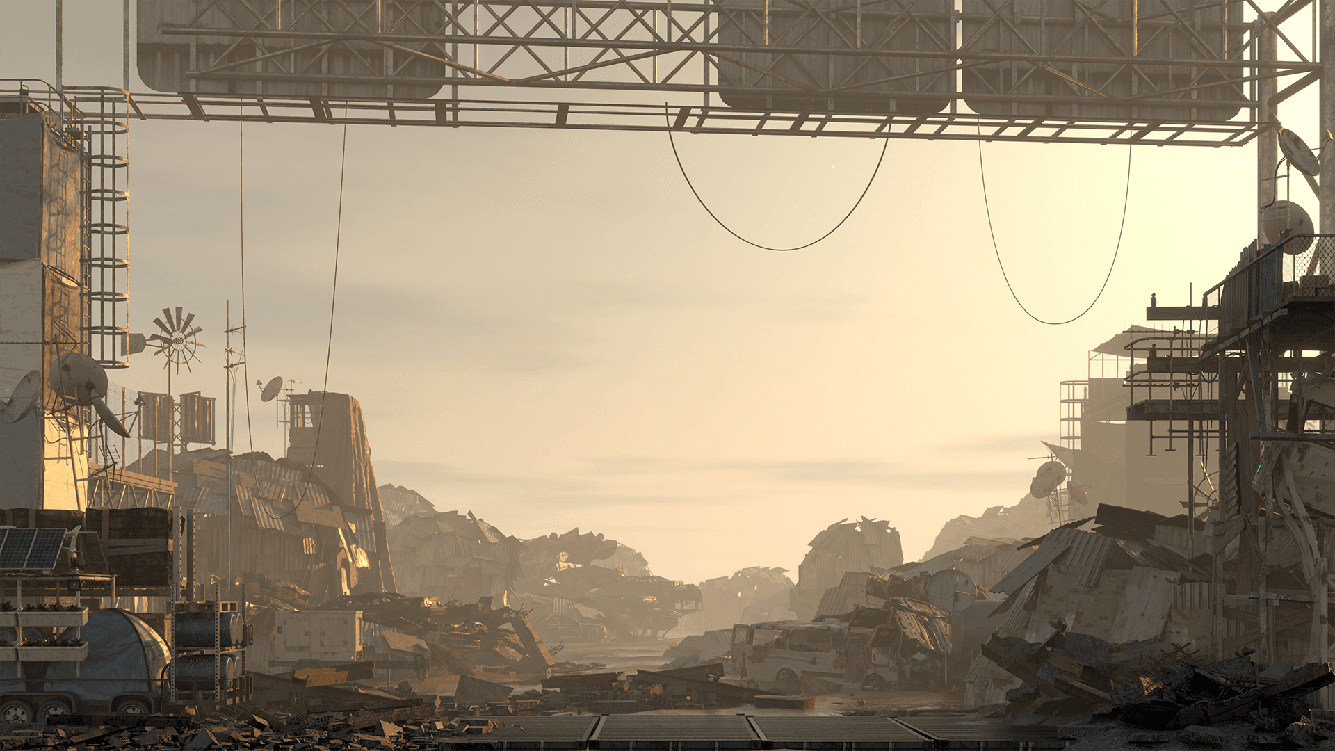
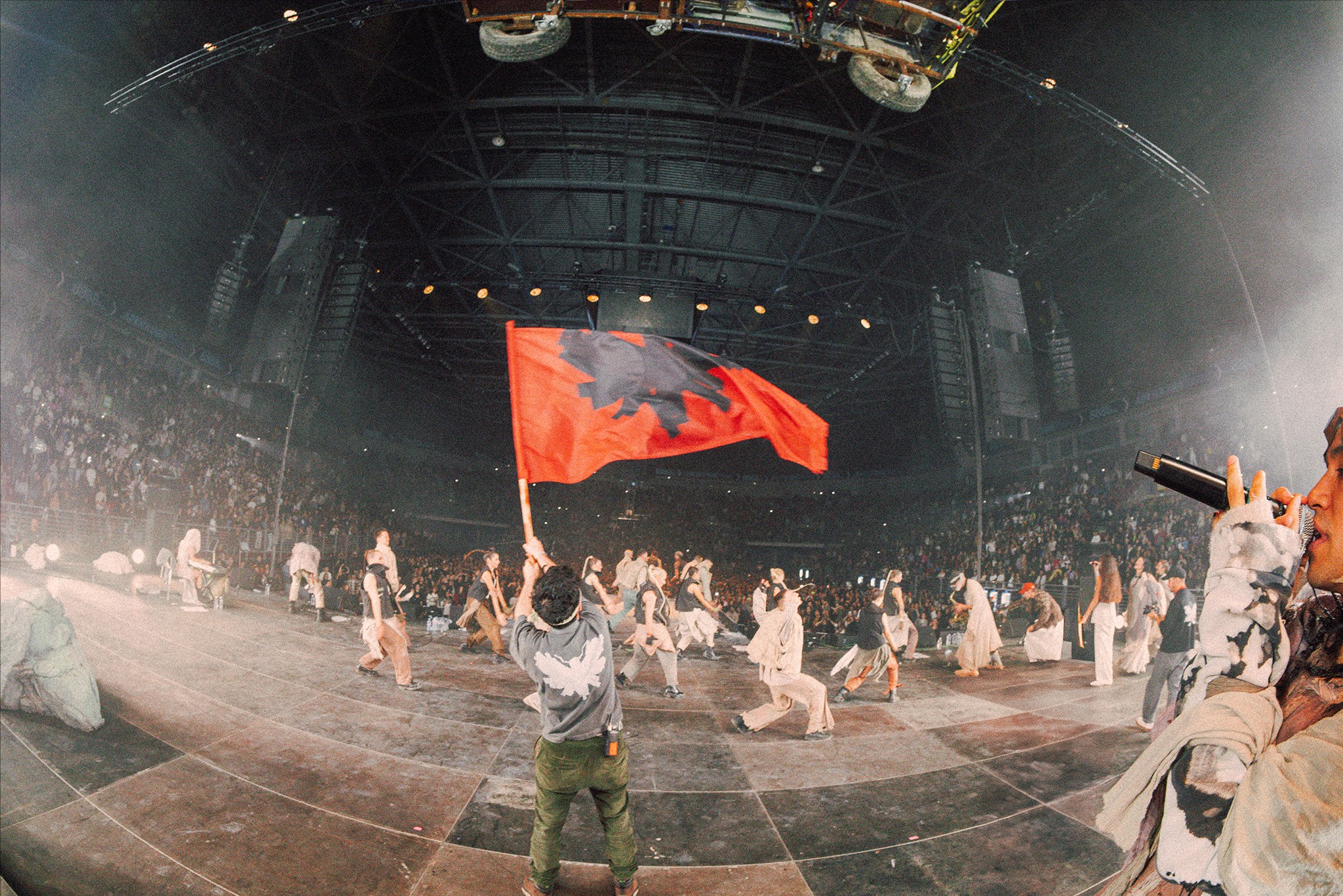
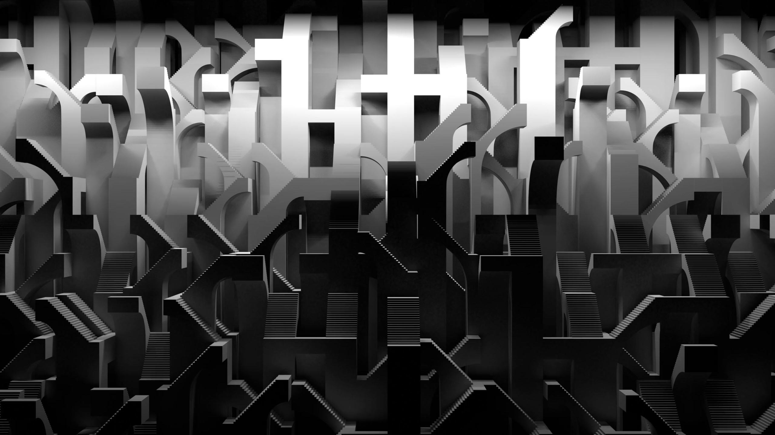
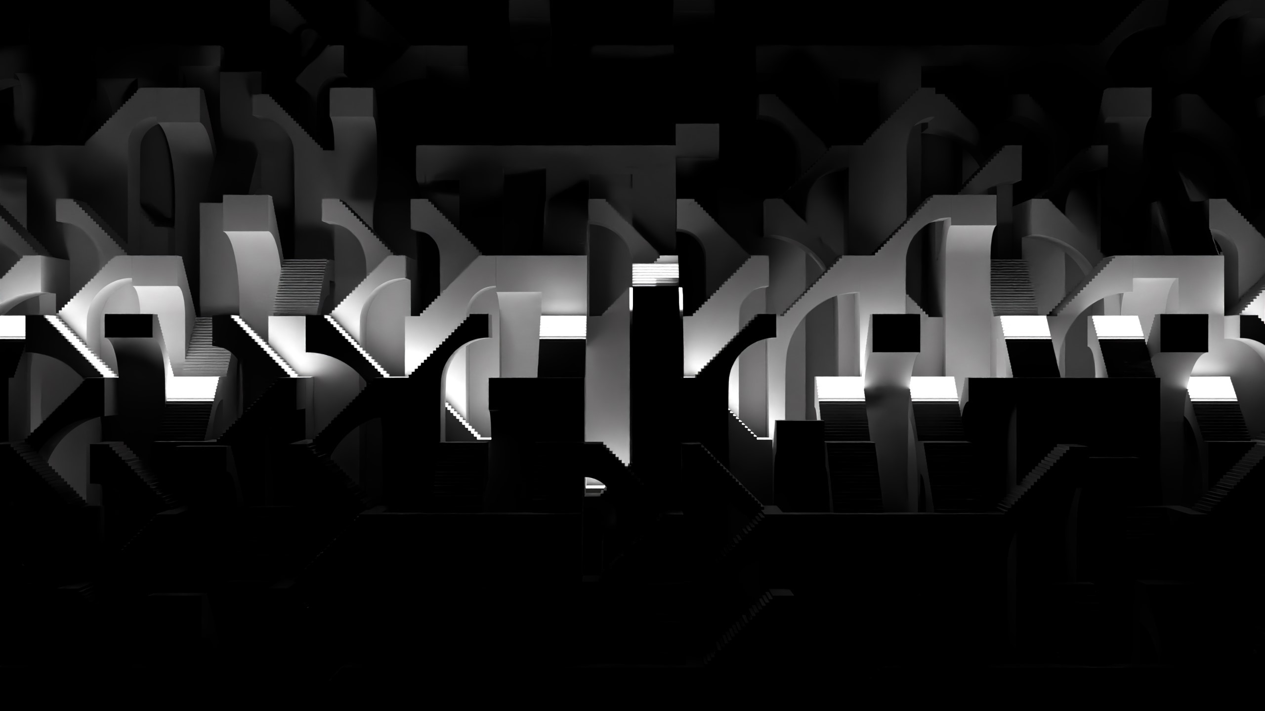
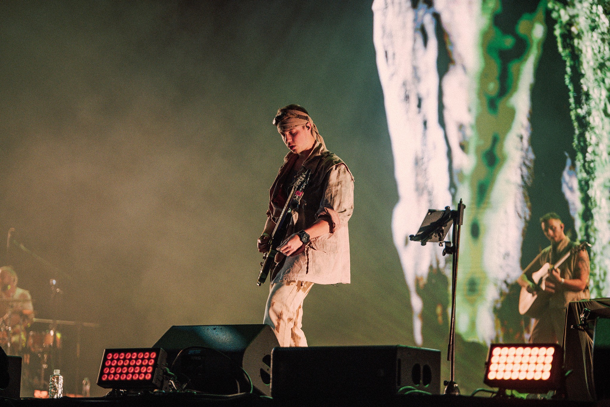
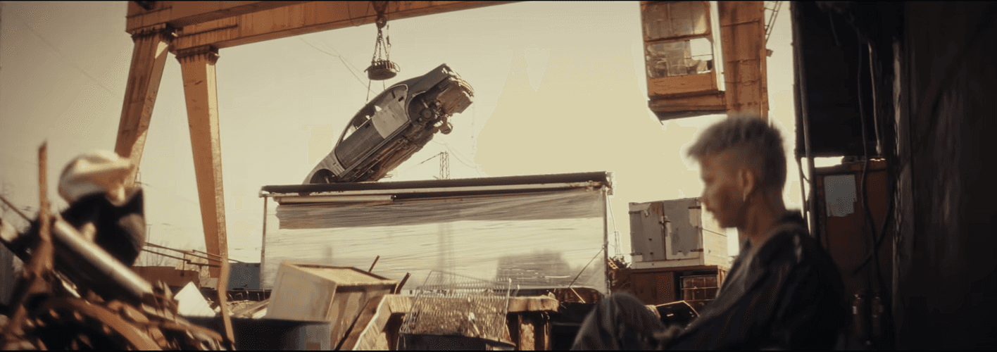
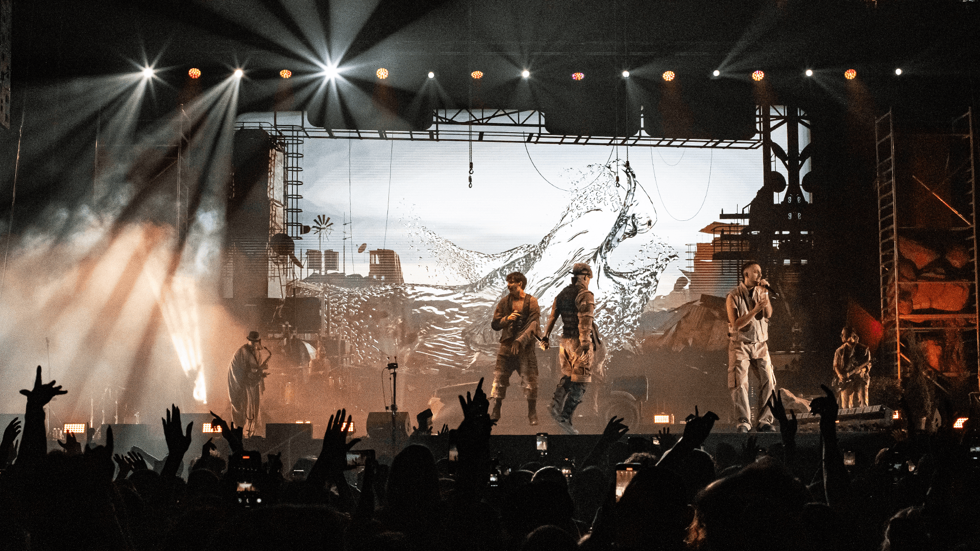
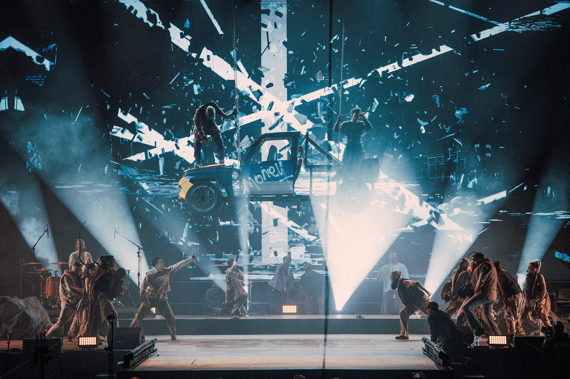
The second half of the show introduced the scrapyard as a continuous spatial environment. Several singles from Molec’s upcoming album had already been released with music videos set in a scrapyard, so the concert visuals were designed to extend that world rather than introduce a new one.
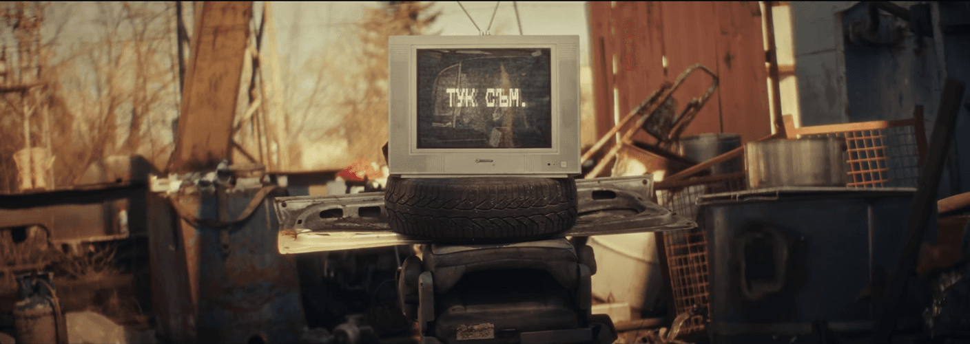
03a_Scrapyard: constructing the space
03a_Scrapyard: constructing the space
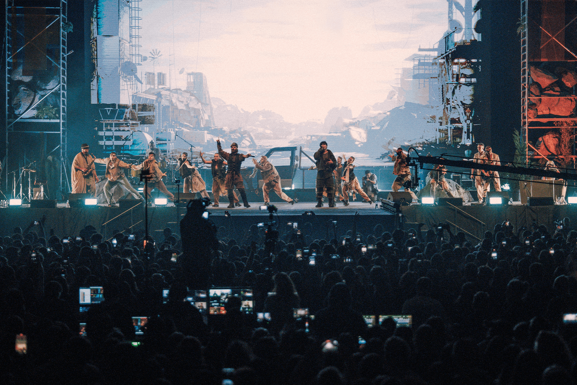
This part of the show was conceived as a single, evolving space rather than a sequence of separate scenes. The environment had to remain coherent across transitions, allowing light, mood, and density to change without breaking continuity.
The primary challenge was spatial credibility. The scrapyard needed to align with the audience’s perspective, read clearly at scale, and support long sections of the performance without visual fatigue — functioning as a stable world that could host variation rather than a backdrop for isolated moments.
This part of the show was conceived as a single, evolving space rather than a sequence of separate scenes. The environment had to remain coherent across transitions, allowing light, mood, and density to change without breaking continuity.
The primary challenge was spatial credibility. The scrapyard needed to align with the audience’s perspective, read clearly at scale, and support long sections of the performance without visual fatigue — functioning as a stable world that could host variation rather than a backdrop for isolated moments.
Objectives:
- Let the image fade naturally at the screen edges
- Build clear depth through layered composition
- Match the audience perspective accurately
- Maintain true 1:1 scale
- Treat the scene as one continuous environment
- Enable seamless transitions between songs
- Use lighting and atmosphere to suggest progression
Objectives:
- Let the image fade naturally at the screen edges
- Build clear depth through layered composition
- Match the audience perspective accurately
- Maintain true 1:1 scale
- Treat the scene as one continuous environment
- Enable seamless transitions between songs
- Use lighting and atmosphere to suggest progression
Together these turned the scrapyard from a backdrop into a location, so the audience was not watching a screen behind the band but sitting inside the same space.
Together these turned the scrapyard from a backdrop into a location, so the audience was not watching a screen behind the band but sitting inside the same space.
Process
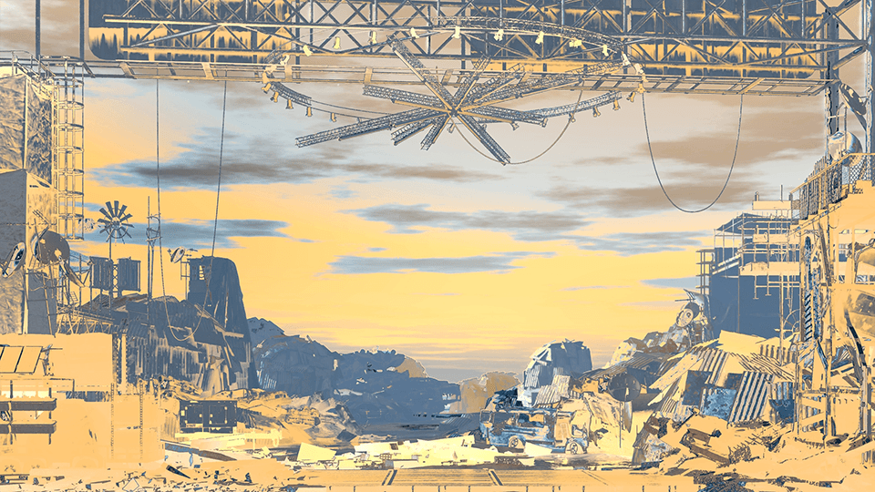
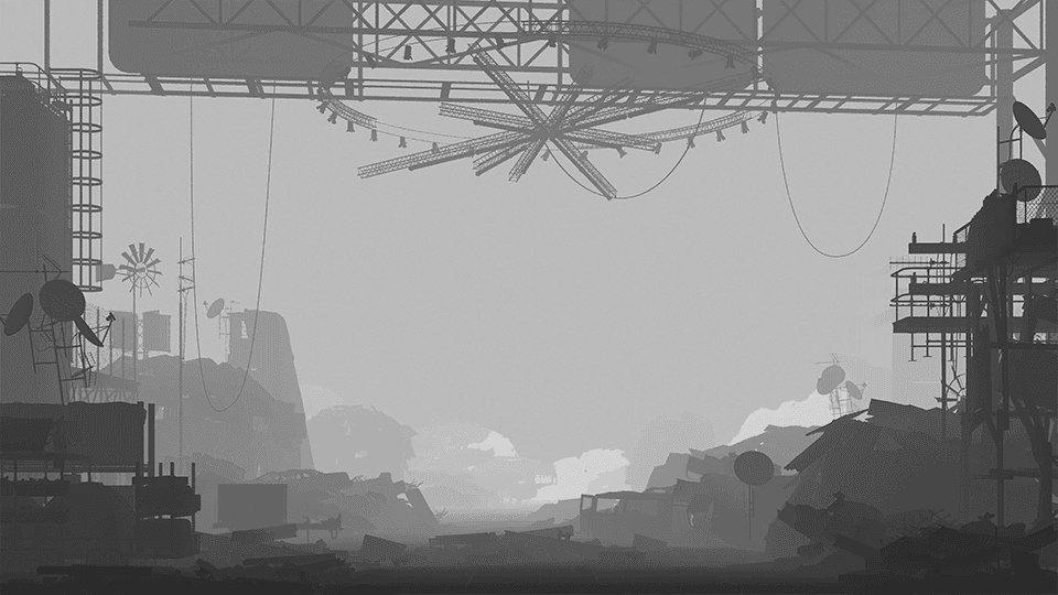
First, we analyzed some existing solutions for scene composition to get ideas how to use Foregroud/Middlegorund/Background to serve the set goals
Snapshots, documenting the process
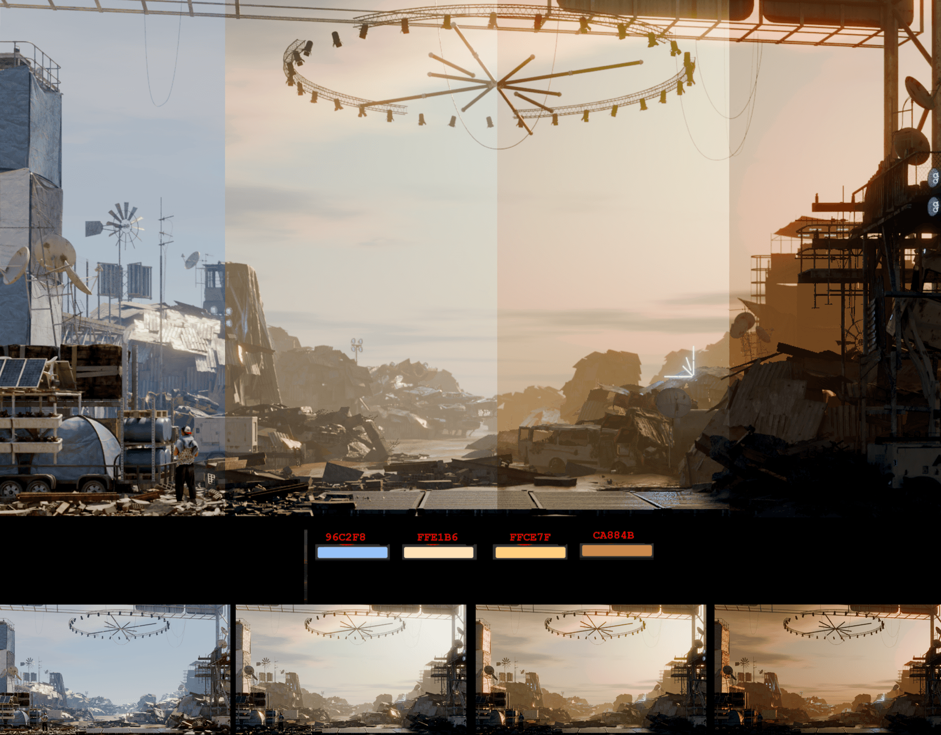
In order to make the show feel like one continuous act, we illustrated going through the sunset, into the night
03b_Scrapyard: States of the Environment
03b_Scrapyard: States of the Environment
After crafting the environment it was time to do some cool stuff on it.
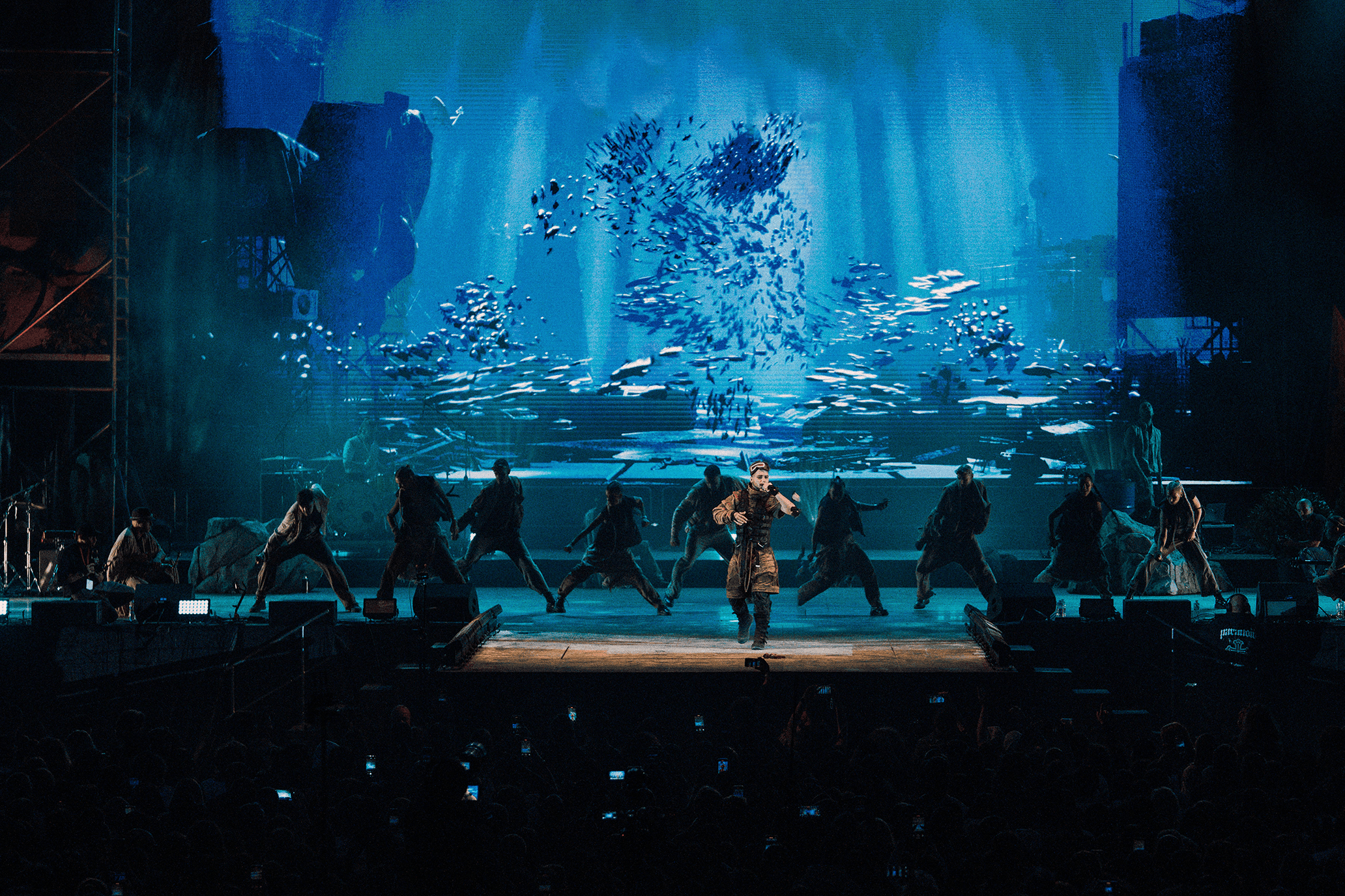
Maybe submerge it under water?
After crafting the environment it was time to do some cool stuff on it.
Maybe submerge it under water?
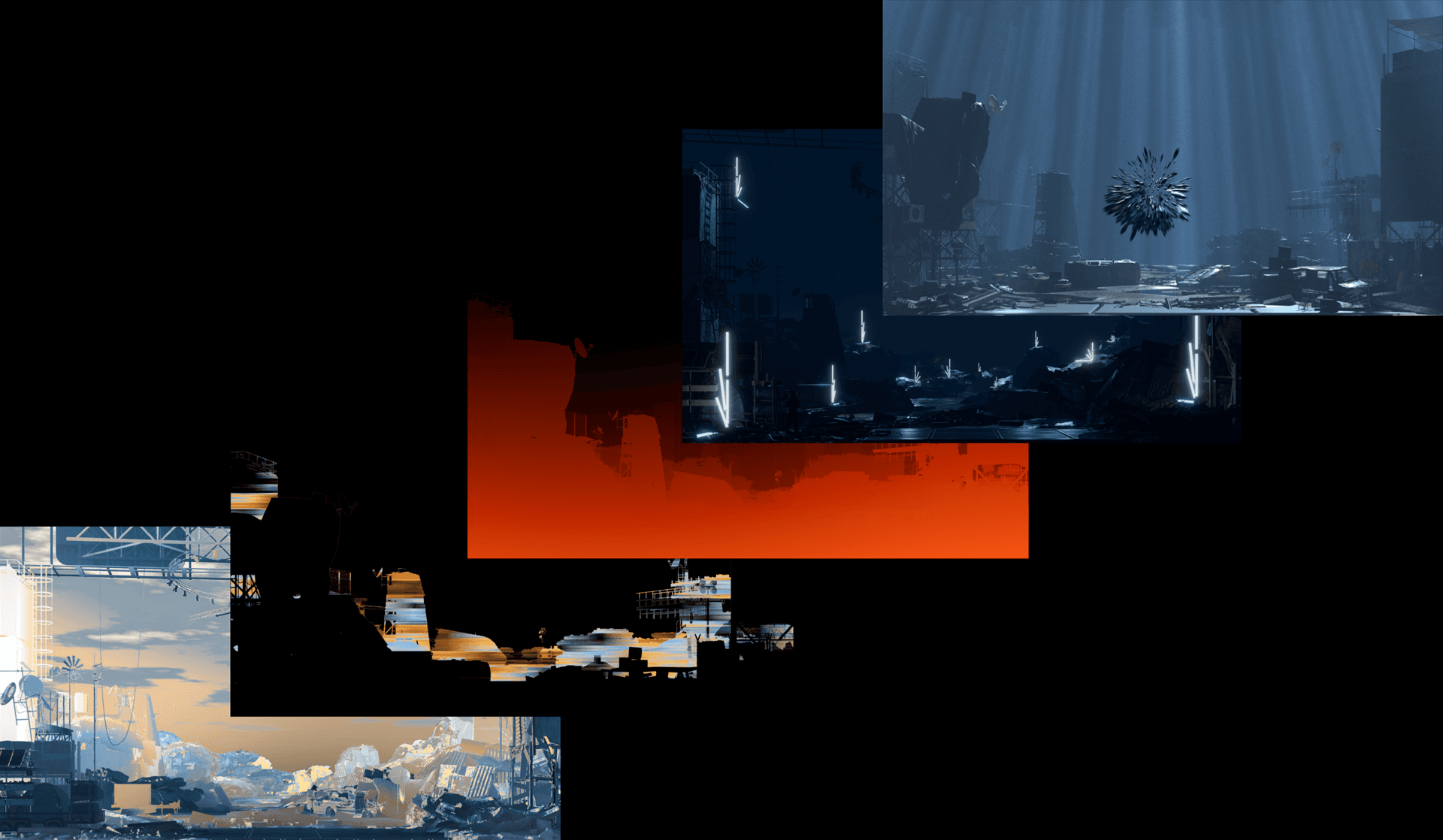
On their previous tour, Molec brought with them the light star from one of their music videos. So we decided to take advantage of 3D and bring for the song as well.
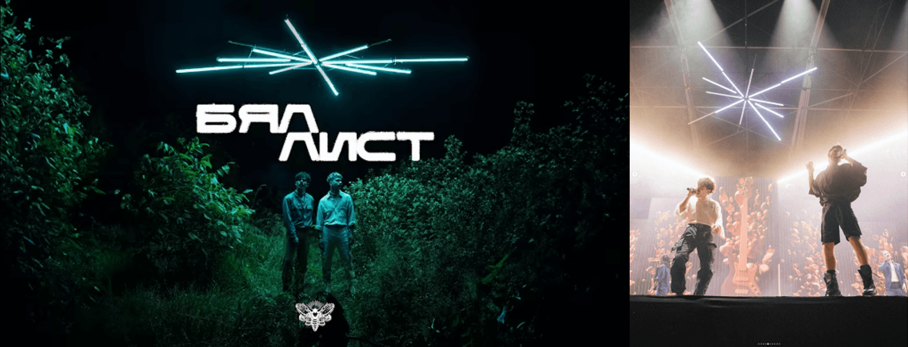
So when we had to introduce the yard, we wanted to tease it, starting from black and gradually turning on scattered lamps on it.
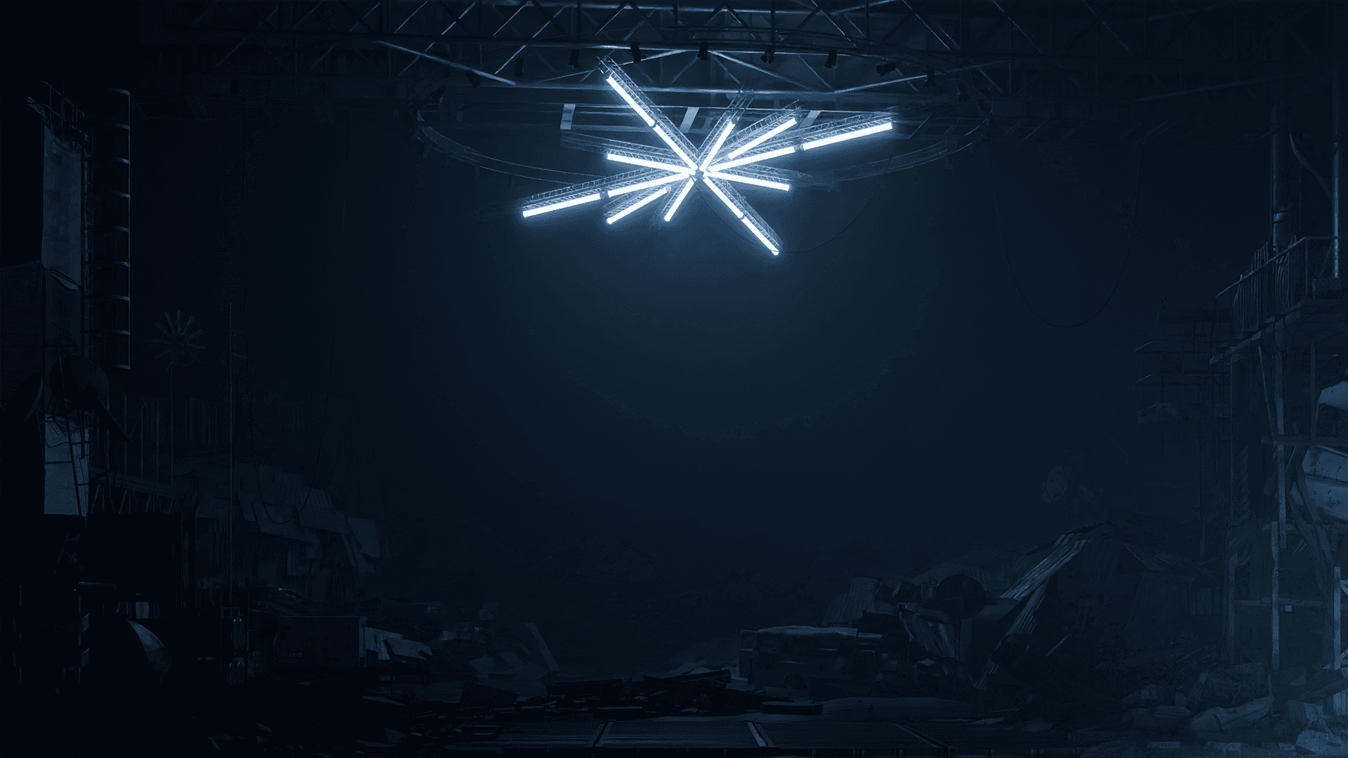
Each lamp was rendered as its own pass, then brought up individually in DaVinci on additive blend. The reveal could be re-timed in the edit rather than re-rendered, so the pacing of the entrance stayed adjustable until the show was locked.
03.1_Byal_List.mp4
03.1_Byal_List.mp4
Sound-synched version
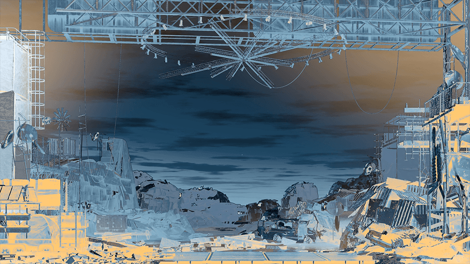
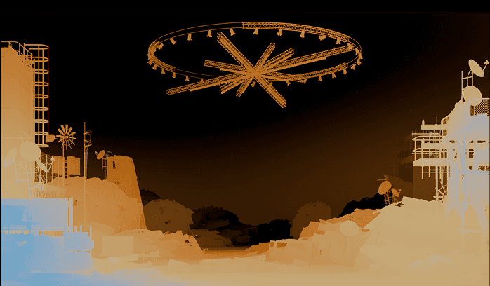
Depth was used to drive gradients through the scene. This introduced progression despite stillness, symbolizing time
03.2_Nikude.mp4
03.2_Nikude.mp4
*Visual by Stefan Bedelev - @poly.universal
03.3_Ti_Li_Si.mp4
03.3_Ti_Li_Si.mp4
03.4_Ima_Koi.mp4
03.4_Ima_Koi.mp4
03.4_Biser.mp4
03.4_Biser.mp4
03.4_Prosti_Mi.mp4
03.4_Prosti_Mi.mp4
04_Reflection
04_Reflection
Twenty two visuals across three acts, built for the duo's largest show to date, under Chris Zahariev's creative direction.
The material asked for restraint. Lyrics rooted in faith and tradition against a modern, rhythm-driven sound, which meant abstraction rather than illustration. Portals, stairs, natural forms. Enough weight to carry the songs, never enough to explain them, and never in front of the performers.
The second half was built as one continuous environment rather than a run of scenes. Matched to the audience's real sightline, held at true scale when the screen spec moved by thirty percent, and lit to carry an hour of performance without fatigue. A backdrop cannot absorb that much variation. A world can.
Twenty two visuals across three acts, built for the duo's largest show to date, under Chris Zahariev's creative direction.
The material asked for restraint. Lyrics rooted in faith and tradition against a modern, rhythm-driven sound, which meant abstraction rather than illustration. Portals, stairs, natural forms. Enough weight to carry the songs, never enough to explain them, and never in front of the performers.
The second half was built as one continuous environment rather than a run of scenes. Matched to the audience's real sightline, held at true scale when the screen spec moved by thirty percent, and lit to carry an hour of performance without fatigue. A backdrop cannot absorb that much variation. A world can.
.
.
.
A show is not a sequence of visuals. It is one space an audience sits inside for an hour.
A show is not a sequence of visuals. It is one space an audience sits inside for an hour.
A show is not a sequence of visuals. It is one space an audience sits inside for an hour.
For artists, agencies, and production companies building shows where the visuals have to hold a room for the full run. Let's talk.
For artists, agencies, and production companies building shows where the visuals have to hold a room for the full run. Let's talk.